
Netflix: Group Watch Feature
A social viewing feature added to Netflix designed to help users feel more connected despite physical distance. It enables friends and family to watch together seamlessly with synchronized playback, built-in reactions, and simple invite controls.
Role: UX/UI Designer and Researcher.
Duration: 2 months.
Tools: Figma, Miro.
Problem
As more people found themselves living apart from friends and family, watching Netflix together became harder than it should be. Third-party tools were clunky and unreliable, and that feeling of being in the same room laughing at the same moment, reacting together was hard to recreate. People wanted something simpler, something that just worked.
Who am I Designing for?
I designed this for people who love watching shows and movies with the people they care about, but don't always have the luxury of being in the same room. Whether it's a long-distance couple, college friends spread across different cities, or siblings who moved away from home — they all share the same frustration of wanting to feel connected while watching together, without the hassle of complicated setups or unreliable tools.
Listening Before Solving
I aimed to understand how people experience watching content remotely with others, what emotional and technical frustrations arise when using third-party tools, and what features would make a shared viewing experience feel genuinely connected.
The goal was to uncover insights that would guide the design of a native Netflix feature that eliminates friction, preserves real-time emotional reactions, and helps people feel close, no matter the distance.
This plan included:
User Interviews
Secondary Research
User Interviews
I recruited 5 participants who regularly stream content and have experience watching remotely with others. The goal was to learn about their habits, frustrations, and emotional motivations around social viewing and to understand what would make a built in group watch experience feel natural and worth using.
Competitive Analysis
After conducting user interviews, I explored the tools participants currently use to watch together remotely, such as Teleparty, Hulu Watch Party, and Disney+ GroupWatch. This helped me understand where existing solutions succeed and where they fall short.
Key Insights
Most tools require extra setup or third-party extensions instead of a built-in seamless experience
Social features are limited to basic text chat — no voice, video, or meaningful reactions
No platform offers collaborative content discovery or "what should we watch together" recommendations
Sync and playback issues remain a consistent pain point across tools
Netflix itself has no native group watch feature, despite being the most used platform
Opportunity
A built-in Netflix feature that combines seamless sync, real-time reactions, and shared content discovery in one place, no extensions, no friction, just connection
Affinity Map
After conducting my interviews, I organized all findings into an affinity map to identify patterns and group common themes. This helped me move from raw interview data to clear, actionable insights, clustering responses around key areas like motivations, frustrations, privacy concerns, and desired features. Seeing the patterns visually made it clear which needs were most consistent across participants and which would be most critical to address in the design.
Challenges
Users relied on third-party tools like Teleparty and Discord screen share
Sync issues and lag constantly broke the experience
complicated setup made spontaneous watch parties nearly impossible
What Users Wanted
Smooth sync and lightweight reactions
Simple invite system
Host-controlled playback
Chat over voice or video calls
Emotional Motivations
Watching together was about feeling close to people they cared about
Users wanted to recreate the feeling of being in the same room
The emotional gap was just as frustrating as the technical one
Privacy Concerns
Users wanted full control over who joins their session
Nobody wanted their camera or data accessed without consent
User Persona
From these insights, I developed a user persona that captured the core characteristics, goals, and pain points of my primary user — someone who values genuine connection while watching remotely but is frustrated by the friction and unreliability of existing tools.
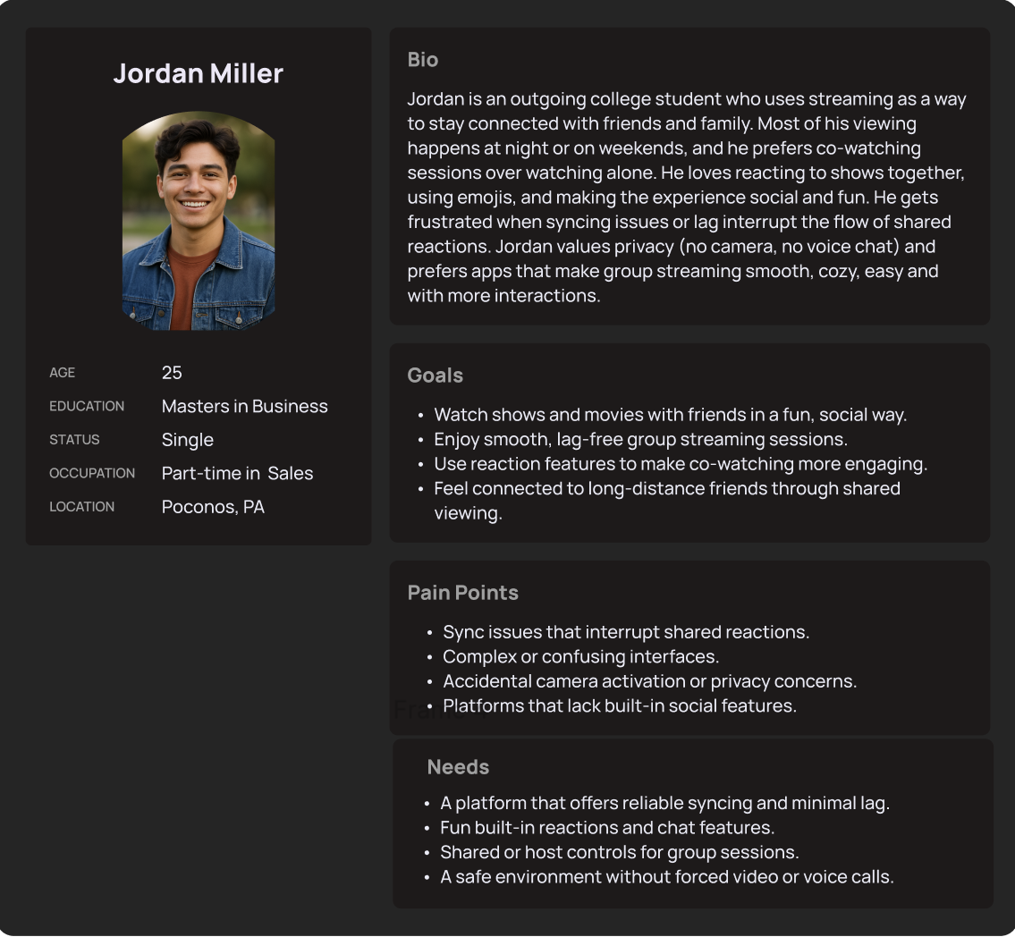
This is Jordan, he represents the type of user who values staying connected with friends and family through shared streaming experiences but is frustrated by the friction, sync issues, and lack of built-in social features on existing platforms.
Solution
Netflix GroupWatch is a built-in co-watching feature that lets friends and family watch together in real time, no third-party extensions, no complicated setup, just a shared experience from within the Netflix app itself.
Key Features:
Easy session creation — start a GroupWatch session directly from any title with one tap
Simple invite system — invite friends via link without requiring them to download anything extra
Synchronized playback — everyone stays in perfect sync, with the host controlling play and pause
Real-time reactions — express emotions through emoji reactions that appear on screen during playback
Cross-device support — works seamlessly across mobile, desktop, and TV
Content discovery — browse and decide what to watch together before starting a session
User Flow
After defining the core features and understanding user needs, I created a user flow to map how users would navigate the group watch experience—from starting or joining a watch session to inviting friends and discovering content together.
The goal of this flow was to ensure a seamless and engaging shared viewing experience that felt natural and easy to follow. It helped identify key interaction points, such as joining a session, as well as potential friction areas before moving into wireframing and refining the interface.
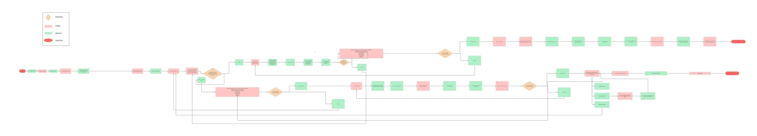
The goal was to make the group watch experience feel simple, seamless, and social without overwhelming the user.
Watching with others should feel natural, so I prioritized clarity: each step guides users from starting or joining a session to inviting friends and reacting in real time, without adding friction.
I wanted to balance guidance + flexibility: users can easily start a session or join one, and stay focused on the content.
This flow reflects how users naturally experience shared viewing: discover → join/start → invite → watch together
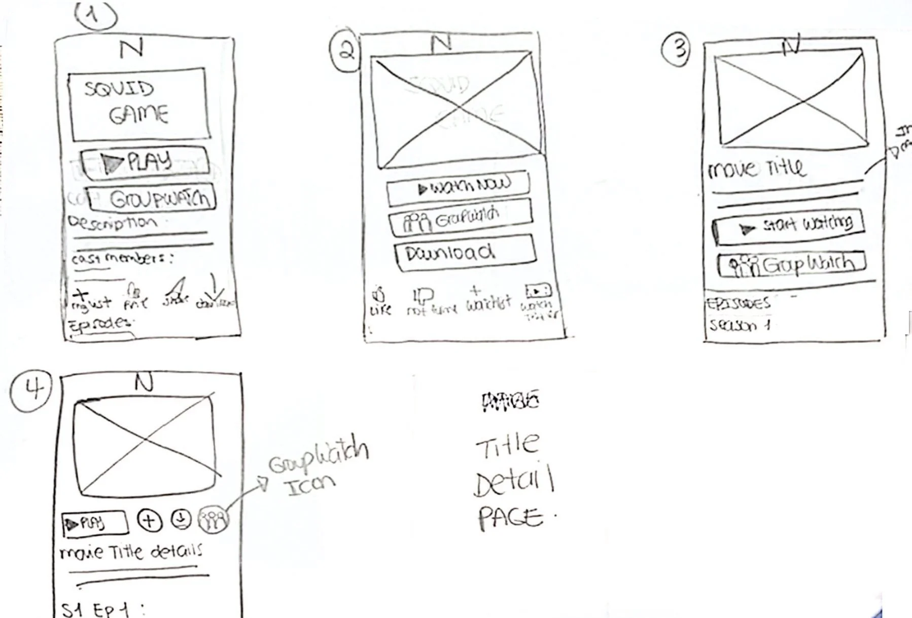
After defining the user and task flows, I moved into creating low-fidelity wireframes to visualize the structure of the group watch experience.
At this stage, my focus was on functionality, hierarchy, and usability—not aesthetics. I sketched and developed simple wireframes to explore different layouts for key features such as starting or joining a watch session, inviting friends, and interacting through reactions during playback.
Mid Fidelity
After testing initial ideas through low-fidelity sketches, I moved into mid-fidelity wireframes to refine the structure, layout, and interactions of the group watch experience.
At this stage, I focused on improving clarity and usability across key flows, such as starting or joining a session, inviting friends, and reacting during playback. The mid-fidelity designs allowed me to better define hierarchy, spacing, and interaction patterns while still iterating quickly before moving into high-fidelity designs.
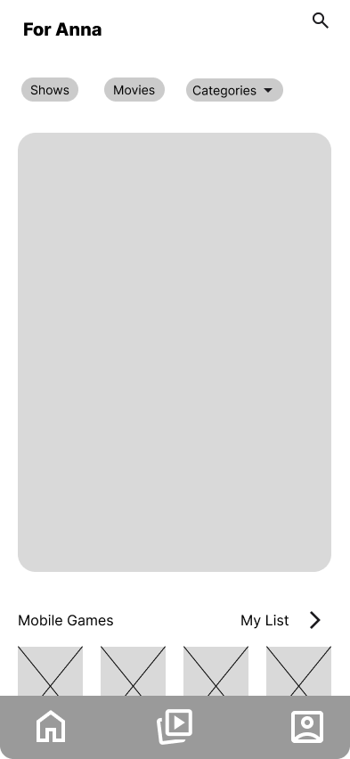
Home
The familiar Netflix home screen where users browse personalized content and discover what to watch.
Personalized recommendations based on viewing habits
Easy access to search, categories, and saved list
Starting point for initiating a GroupWatch session
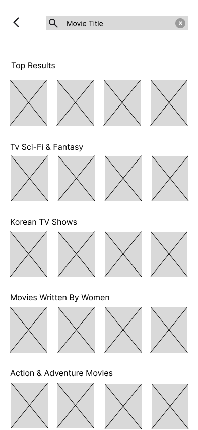
Search & Content Discovery
Users search for a specific title or browse by genre to find something to watch together.
Search by movie or show title
Organized by categories for easy browsing
Helps groups discover content before starting a session
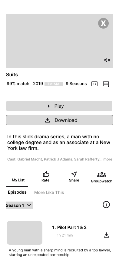
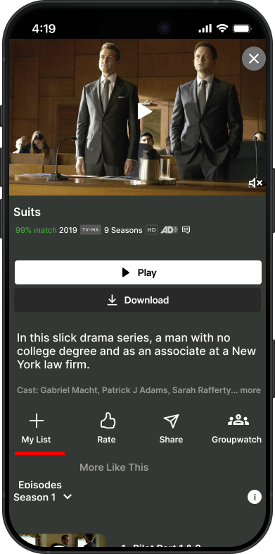
Title Description
A detailed view of the selected title where users can start a GroupWatch session.
Match percentage, rating, and season info displayed clearly
GroupWatch button accessible directly from this screen
Share option to send the title to friends before starting
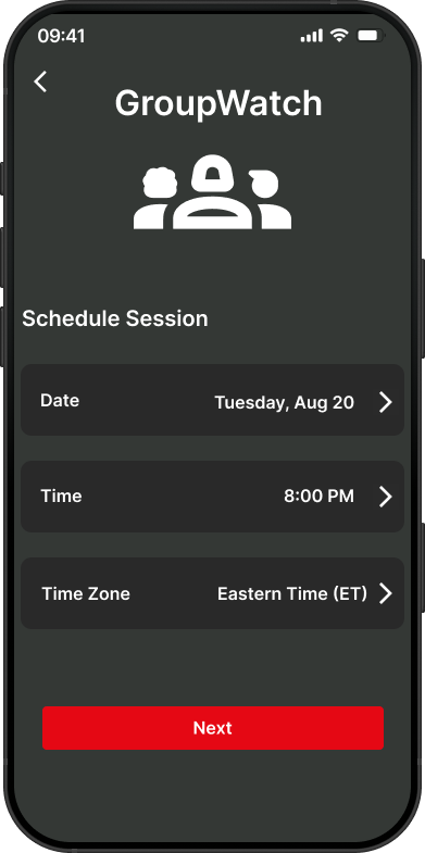
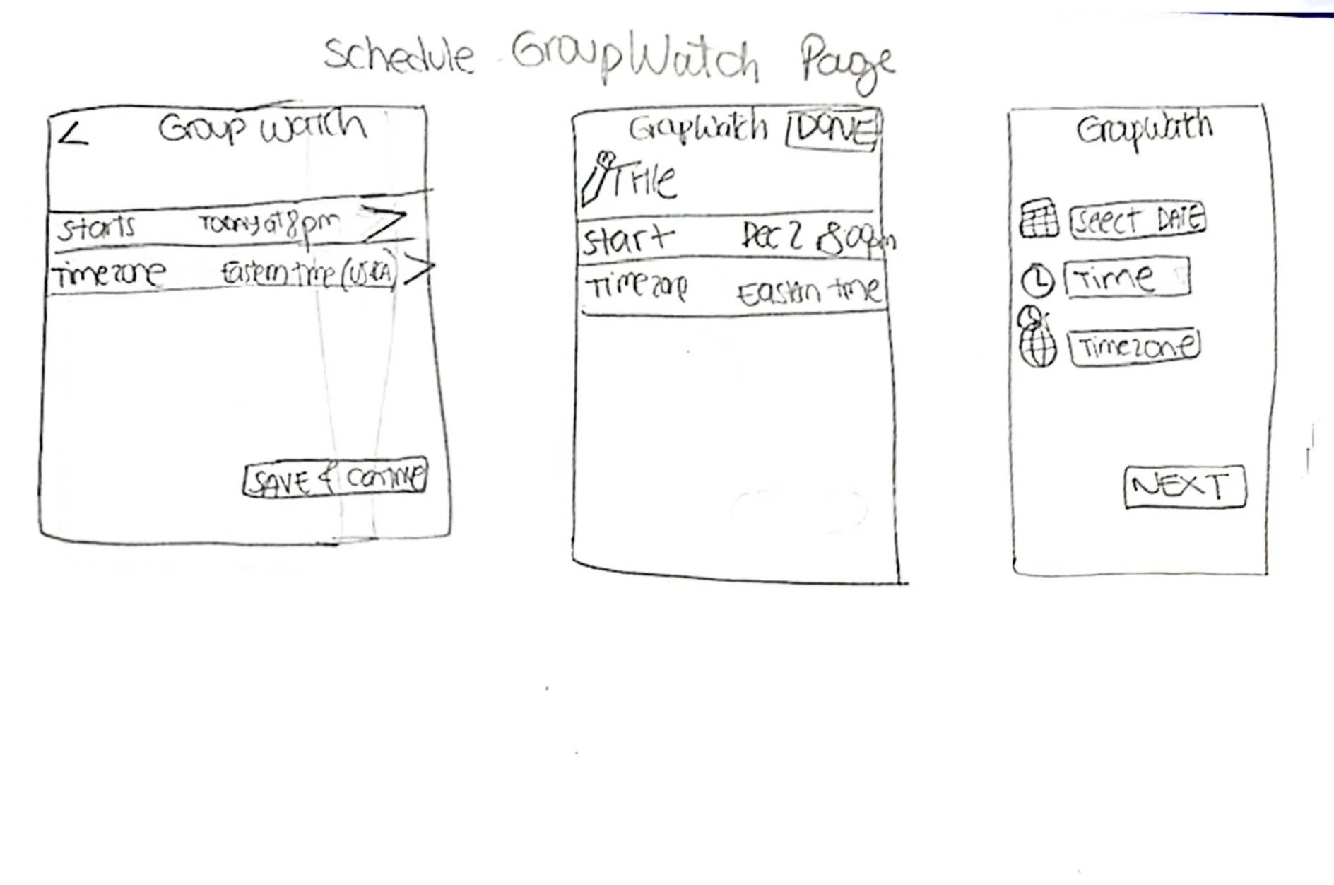
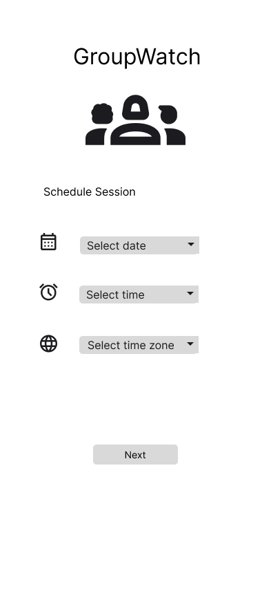
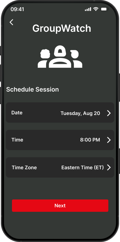
Schedule Session
Users can schedule a GroupWatch session in advance across different time zones.
Select date, time, and time zone
Removes the back-and-forth of coordinating schedules
Makes planning watch parties effortless for long-distance groups
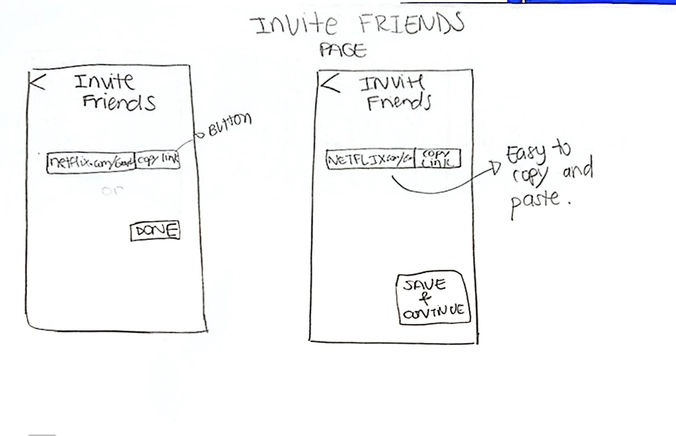
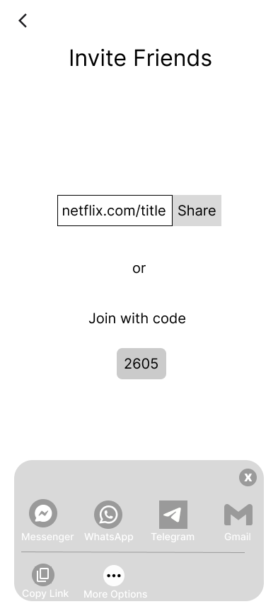
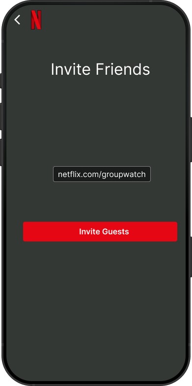
Invite Friends
Users invite friends to join the session via a shareable link or a quick join code.
Share directly through Messenger, WhatsApp, Telegram, or Gmail
Simple join code as an alternative for easy access
Low friction — no extra downloads required for friends
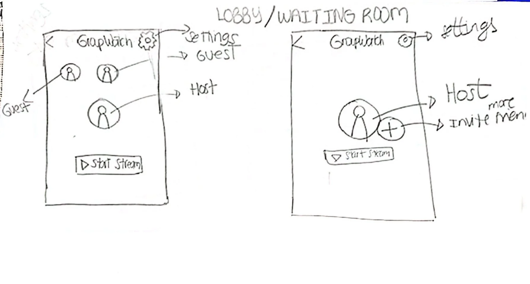
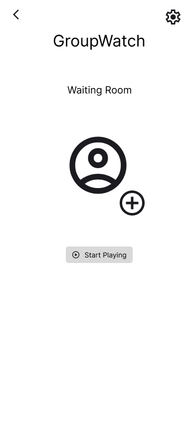
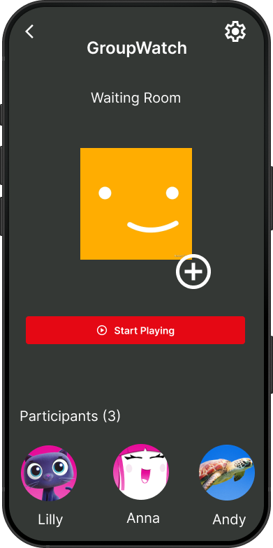
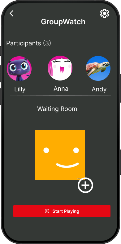
Waiting Room
A dedicated space where participants gather before the session begins.
Confirms everyone is ready before playback starts
Host controls when the session begins with "Start Playing"
Builds anticipation and reduces awkward sync moments
High Fidelity
I added the GroupWatch button directly on the content page to make the experience seamless and easy to access, ensuring users can quickly discover the feature and know it’s available right away.
The Schedule Session screen serves as a key step in setting up the GroupWatch experience — allowing users to plan when they want to watch together. It provides a simple and structured way to select the date, time, and time zone, ensuring everyone can coordinate easily. This helps users feel prepared and in control of their shared viewing experience before inviting others and starting the session
The Invite Friends screen is where the group watch experience begins. It gives the host a simple, shareable link to send to friends — making it easy to start a session without complicated setup or third-party tools. The goal was to make the invite process feel as effortless as possible so nothing gets in the way of watching together.
The GroupWatch Waiting Room is where participants gather before the session begins. Users can see who has joined, add more friends, and start the session when everyone is ready. This screen was designed to build anticipation and give the host full control over when the experience starts — making the group feel connected even before hitting play.
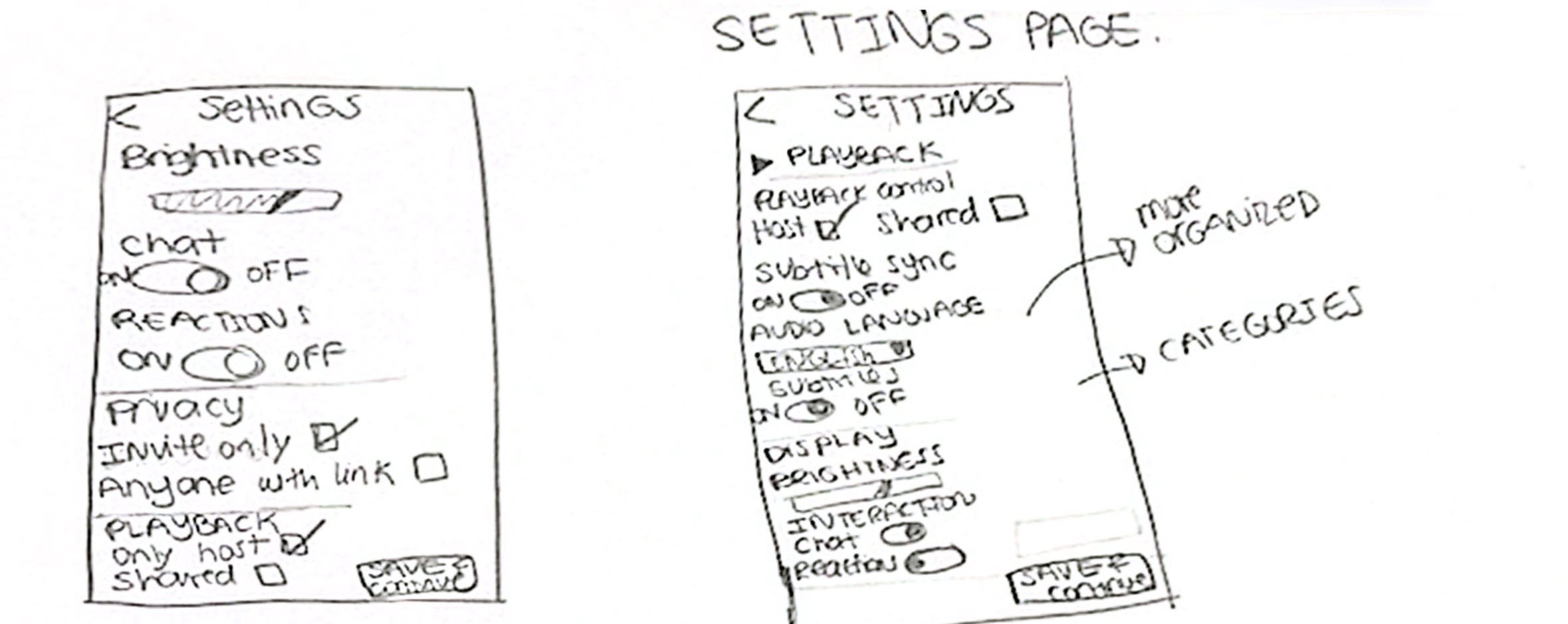
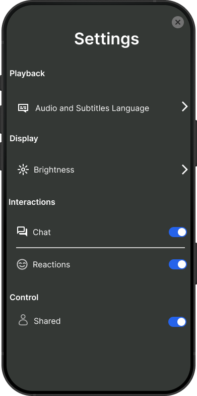
The Settings screen gives users full control over their GroupWatch experience. From adjusting audio and subtitles to toggling chat, reactions, and shared playback controls, every setting was designed to let users personalize how they interact — ensuring the experience feels comfortable and non-intrusive for everyone in the session.
Usability Test Results
I conducted usability testing with five participants to evaluate the prototype. The goal was to observe how easily users could complete key tasks such as creating a session, inviting friends, reacting during playback, and managing group settings.
Findings
Most users were able to complete all tasks successfully and found the experience easy to use
The scheduling flow (date, time, time zone) felt clear and familiar to users.
Inviting friends was straightforward and matched how users normally share links.
Some users had difficulty noticing the GroupWatch feature right away, especially on mobile.
A few users felt unsure about who had control (host) during the session.
Iterations
I refined the waiting room layout to highlight participants more clearly, improving visibility and making the experience feel more collaborative before starting the session.
Before
After
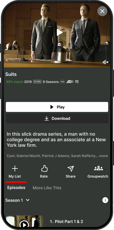
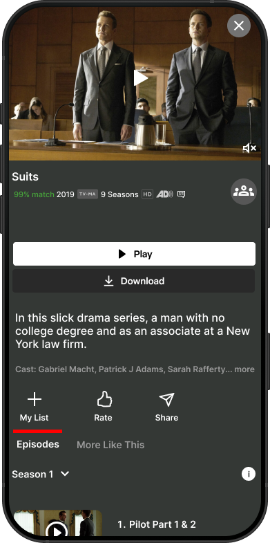
During testing, users had difficulty locating the GroupWatch button since it was buried among other actions at the bottom of the screen. I iterated by moving it to a more prominent position at the top right corner of the title page, making it instantly visible and easier to access when users want to start a session.
Before
After
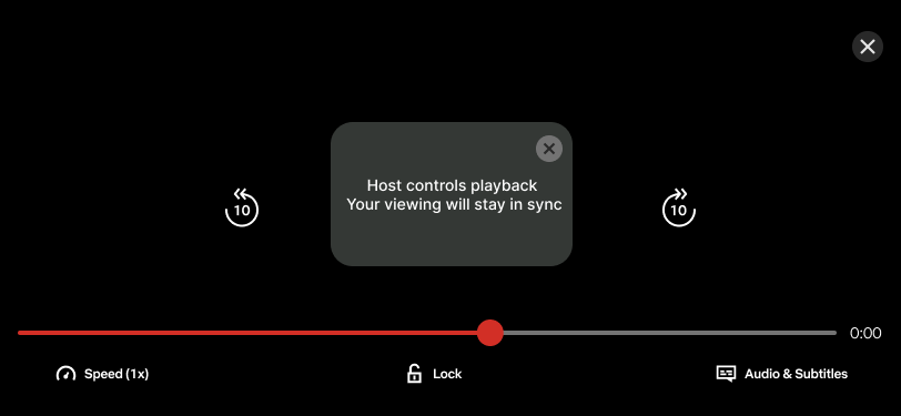
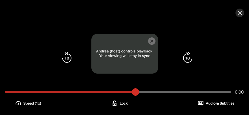
During testing, users weren't sure who exactly was controlling the playback. I iterated by replacing the generic 'Host' label with the host's actual name so participants always know specifically who is in control of the session, making the experience feel more transparent and trustworthy.
Before
After
If I had more time…
Conducting additional usability testing, testing with a larger and more diverse group of users to validate improvements and uncover deeper insights.
Enhancing social interaction during playback, exploring additional lightweight ways for users to engage (e.g., reactions visibility or timing) without distracting from the content.
Expanding personalization, tailoring recommendations or session suggestions based on user preferences and watch history.
Key Learnings
Learned how to turn usability insights into focused design improvements, especially around clarity and feature visibility.
Strengthened my ability to identify high-impact iterations, even when overall feedback is positive.
Gained experience designing for shared, social interactions within a streaming experience.
Discovered that small changes like improving hierarchy or adding clear labels can significantly improve user confidence.
Developed a deeper understanding of how users interpret control and ownership in collaborative features.