
Lyndhurst Public Library Website Redesign
A redesigned website for the Lyndhurst Public Library aimed at improving accessibility, navigation, and overall user experience. My role included UX research, information architecture, wireframing, prototyping, usability testing, and final UI design.
Role: End-to-end UX/UI Designer
Duration: 1.5 months
Tools: Figma, Miro
Problem
The Lyndhurst Public Library website lacked clear organization and intuitive navigation, making it difficult for users to quickly find important information like services, events, and resources.
Who am I Designing for?
I designed for a diverse group of users, including residents, students, families, and seniors who rely on the library for information, resources, and community services. The experience needed to be simple, accessible, and easy to use for all levels of digital experience.
Listening Before Solving
I aimed to understand how people experience navigating the Lyndhurst Public Library website, what frustrations arise when searching for books, events, and essential information, and what improvements would make the experience feel intuitive and easy to use.
The goal was to uncover insights that would guide the redesign of the library's website — improving navigation, information architecture, and accessibility for all community members.
User Interviews
I recruited 5 participants with varying levels of experience using public library websites, from frequent to occasional users. The goal was to understand their habits, frustrations, and expectations when trying to find information online, and to identify what would make a library website feel intuitive, accessible, and easy to use for a wide range of users.
Affinity Map
I organized interview insights into an affinity map to identify patterns across participants. By grouping responses into themes like user goals, navigation behavior, and pain points, I uncovered key insights, users want quick access to essential information, clear navigation, and a more modern, organized experience. These findings guided my design decisions throughout the redesign.
Challenges
Difficulty finding important information quickly
Too many menus and unclear labels
Content feels cluttered and overwhelming
Important sections (like events) are not easy to locate
Too many clicks to complete simple tasks
What Users Want
Quick access to hours, events, and resources
A clear and simple layout
Strong search functionality
Easy to understand navigation
Less text, more scannable content
A modern and visually clean design
Emotional Motivations
Users want to feel confident and in control when navigating
Frustration when the site feels outdated or confusing
Expectation of a smooth, fast experience
Desire for a website that feels modern and trustworthy
Important Takeaways
Users don’t explore, they want answers fast
The homepage is the most important screen
Design impacts trust, not just usability
Simplicity and clarity matter more than adding features
Good organization reduces frustration and improves experience
User Persona
From these insights, I developed a user persona that captured the core characteristics, goals, and frustrations of my primary user, someone who relies on the library website to quickly find information and resources but is often frustrated by unclear navigation, outdated design, and difficulty locating key content.
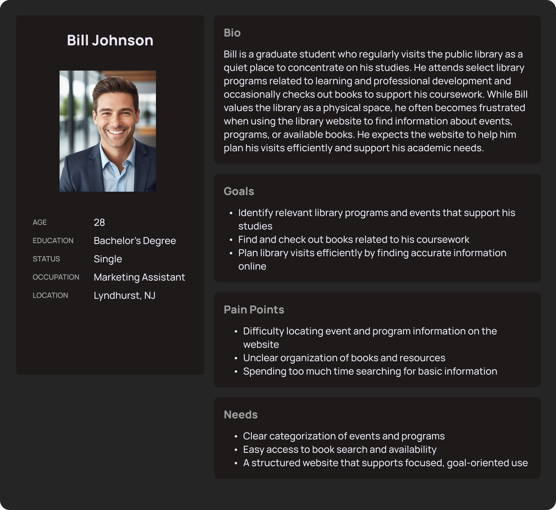
This is Bill, he represents the type of user who values the library as a resource for his studies and personal growth but is frustrated by the lack of clear organization and accessible information on the website, making it difficult to plan his visits efficiently.
Sitemap
After defining the core features and understanding user needs, I created a site map to outline how users would navigate the library website, from the homepage to key sections like events, the book catalog, and library information.
The goal was to ensure a clear and logical structure that made finding information feel effortless. It helped identify how content should be organized and prioritized before moving into wireframing and designing the interface.
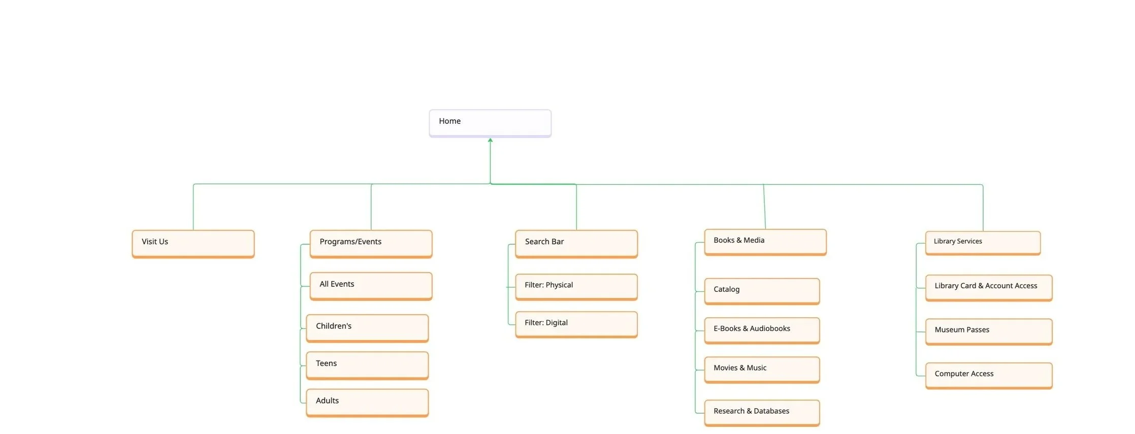
Why I chose this?
The goal was to make navigating the library website as simple and intuitive as possible.
Libraries serve diverse users with different needs, so I prioritized clear organization grouping content into logical sections so users can find what they need without confusion.
I wanted to balance simplicity with discoverability, users can easily access key areas like events, the catalog, and hours without having to dig through multiple pages.
This structure reflects how users naturally think: arrive → find information → explore resources → plan visit.
Problem Statements
Through my research I identified three core problem areas that were consistently causing friction for users. Each one represented a moment where the website failed to meet user expectations, making simple tasks feel unnecessarily complicated and reducing trust in the library's digital presence.
Problem Statement 1: Finding & Checking Out Books
When users visit the library website to search for books and check availability, unclear information architecture and navigation make it difficult to identify where the catalog lives and how to access it. Users must click through multiple pages or rely on trial and error, which slows task completion and reduces confidence in using the website as a reliable tool for borrowing materials, ultimately limiting engagement with library resources.
Problem Statement 2: Finding Events & Programs
When users look for information about library events and programs—such as workshops, community events, or educational programs—the website does not clearly organize or surface this content. Events are difficult to scan and understand at a glance, making it harder for users to determine what is available and relevant, which can lead to missed opportunities for participation and reduced program attendance for the library.
Problem Statement 3: Finding Essential Visit Information (Hours, Location, Contact)
When users attempt to find essential information such as library hours, address, or contact details, the website does not consistently place this content in predictable or prominent locations. This lack of clarity makes it harder for users to plan visits efficiently and can reduce trust in the website as a dependable source of information, impacting overall reliance on the library’s digital presence.
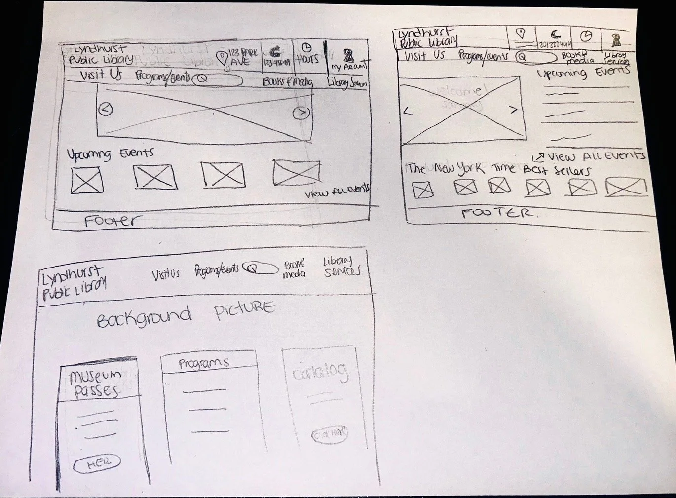
Low-Fidelity Wireframes
At this stage, my focus was on functionality, information hierarchy, and usability — not aesthetics. I sketched simple wireframes to explore different layouts for key sections like the homepage, navigation menu, and events/resources pages, ensuring users could quickly find the information they need.
Mid- Fidelity Wireframes
After testing initial ideas through low-fidelity wireframes, I moved into mid-fidelity designs to refine the website’s structure, layout, and navigation.
At this stage, I focused on improving information hierarchy, organizing content more clearly, and making key sections—like hours, events, and resources—easier to access, ensuring a smoother and more intuitive user experience.
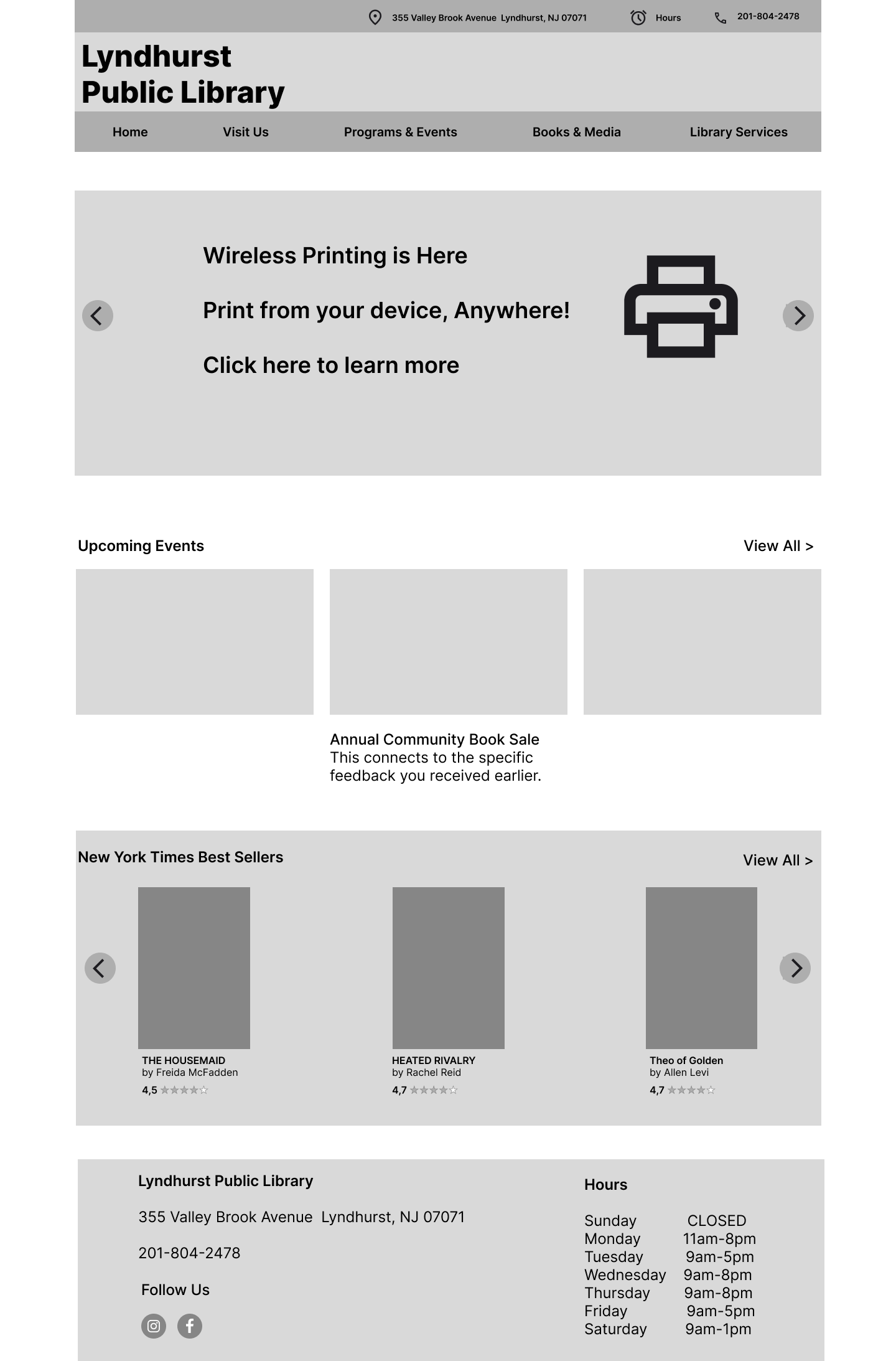
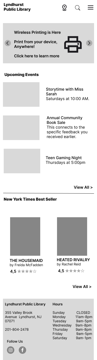
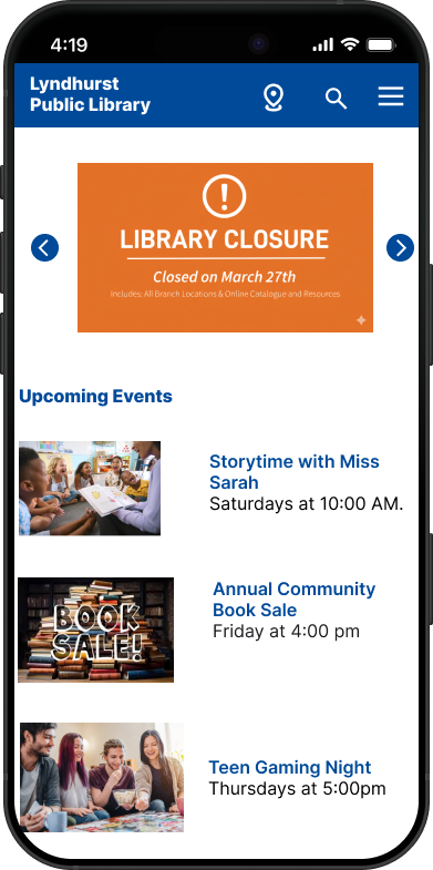
Home
The redesigned homepage gives users a clear and welcoming entry point to everything the library offers.
Essential info (address, hours, phone) visible at the top
Clear navigation across all main sections
Upcoming events and NYT Best Sellers surfaced right on the homepage
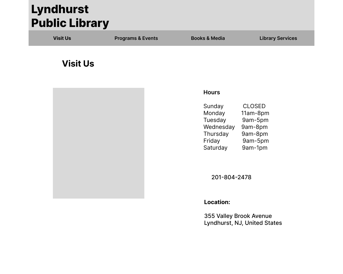
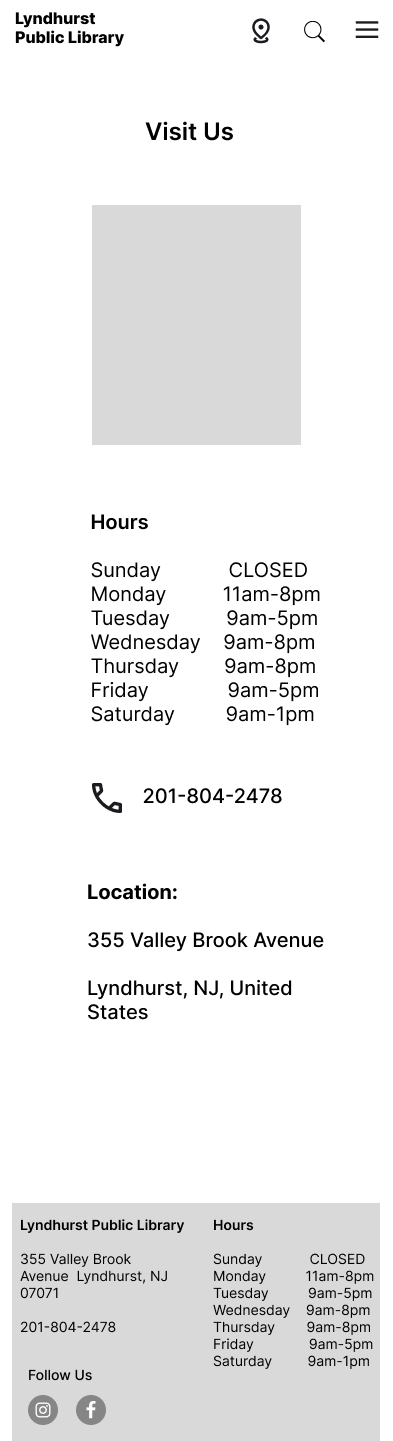
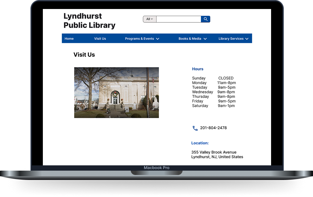
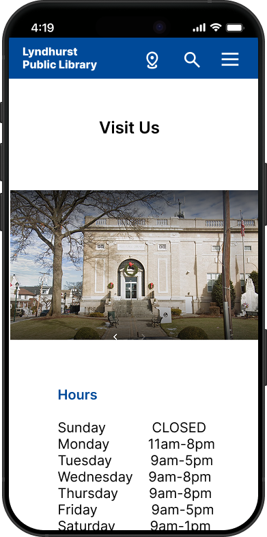
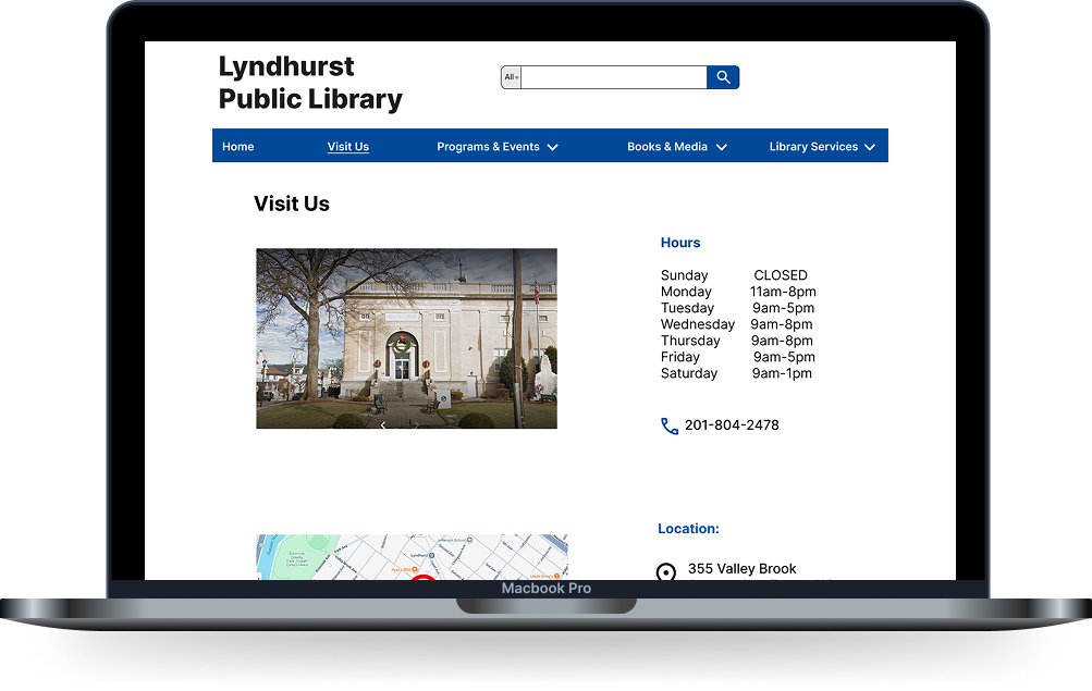
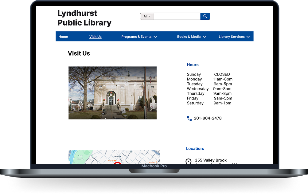
Visit Us
A dedicated page that makes it easy for users to plan their visit without hunting for basic information.
Address and phone number displayed prominently
Map embedded for quick directions
Clean and minimal layout reduces cognitive load
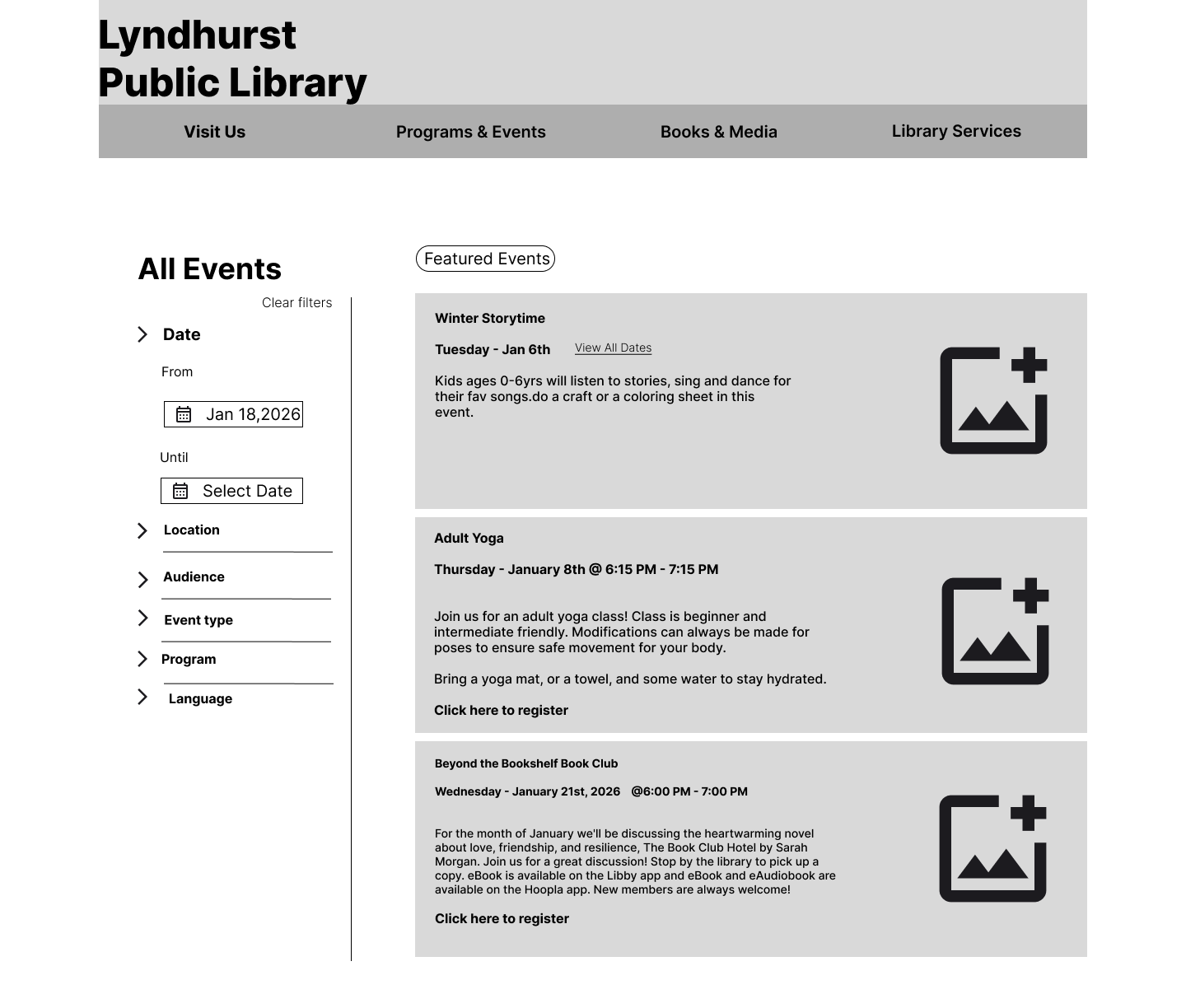
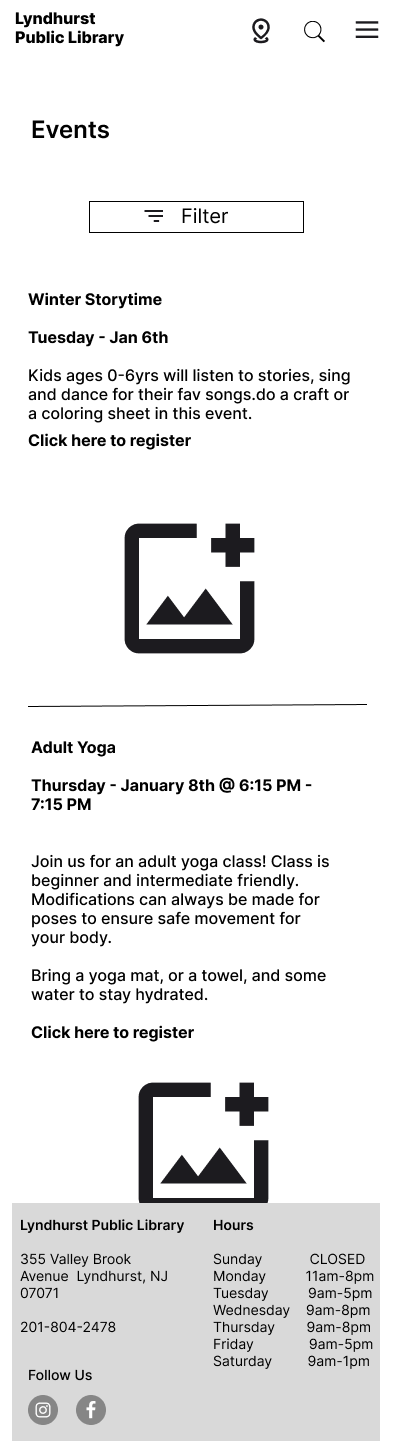
Events & Programs
A fully organized events page that lets users browse and filter what's happening at the library.
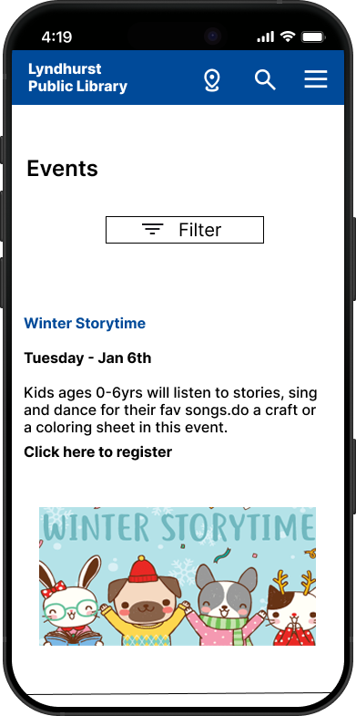
Filter by date, location, audience, event type, and language
Featured events highlighted at the top
Clear event details including date, time, and registration link
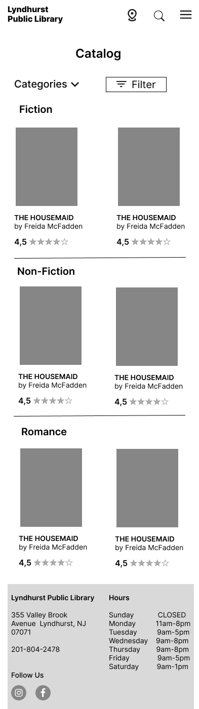
Catalog Browse
A visual and intuitive catalog that makes discovering books feel effortless.
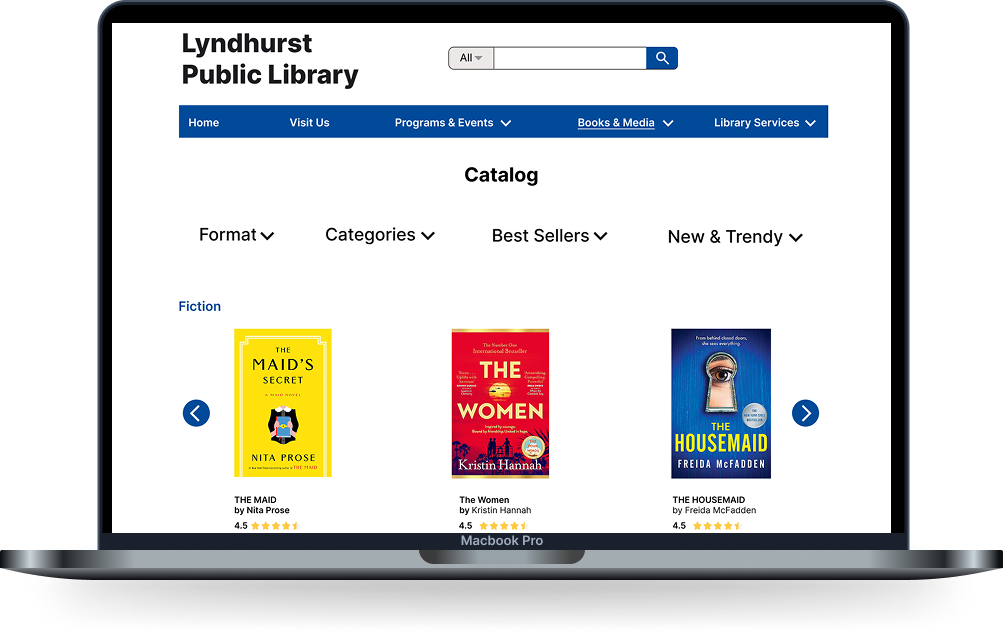
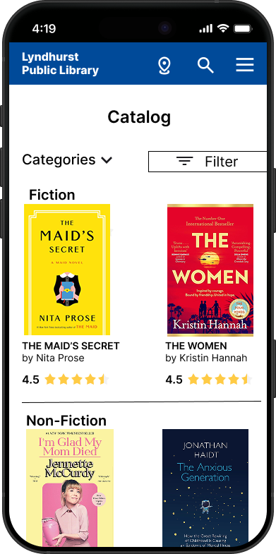
Filter by format, categories, best sellers, and new arrivals
Organized by genre with scrollable rows
Ratings displayed to help users make quick decisions

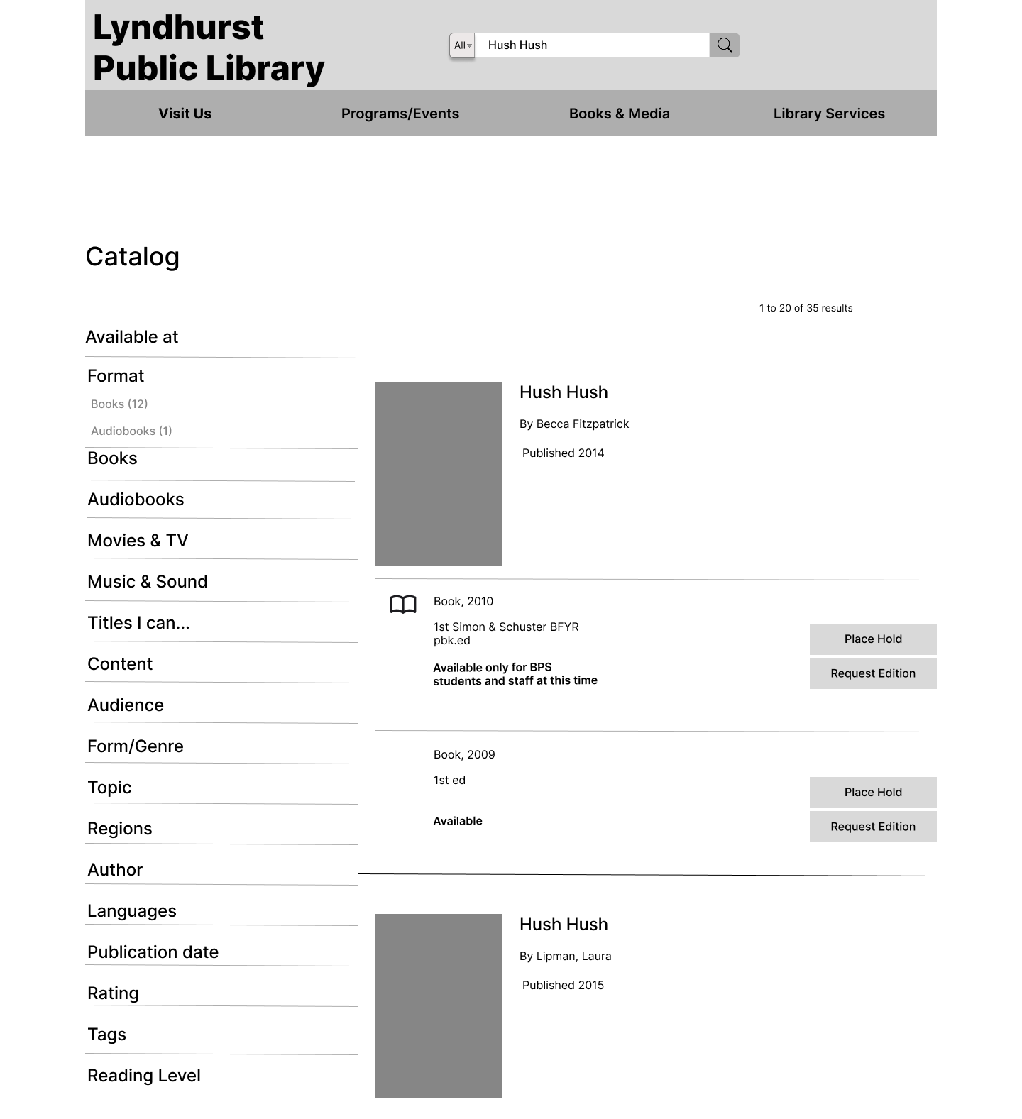
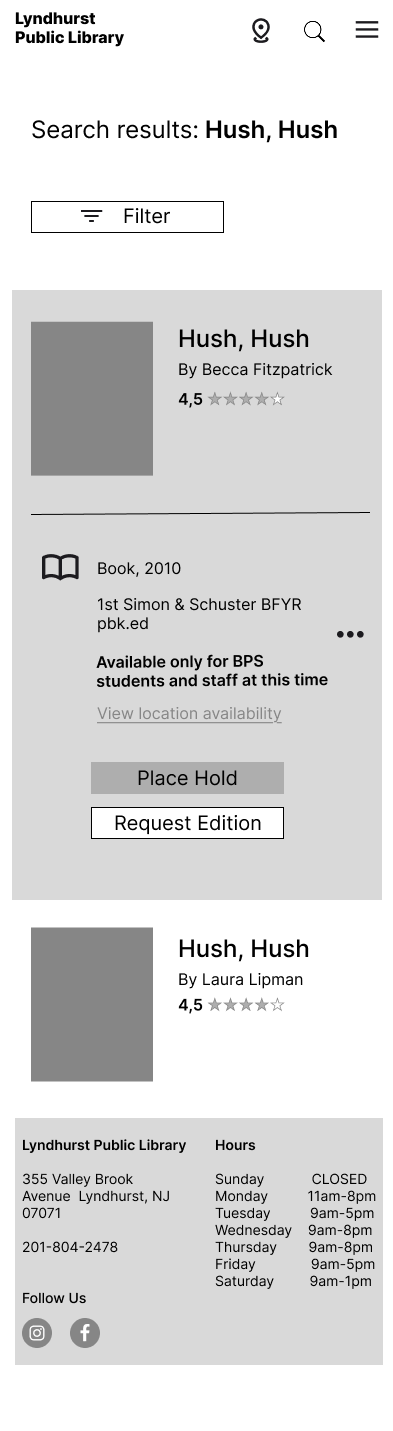
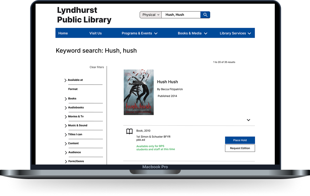
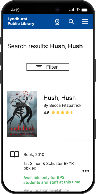
Catalog Search Results
A powerful search experience that helps users find exactly what they're looking for fast.
Search bar prominently placed with filter options
Results show availability, format, and edition clearly
Place Hold and Request Edition actions accessible directly from results
Hi- Fidelity Wireframes
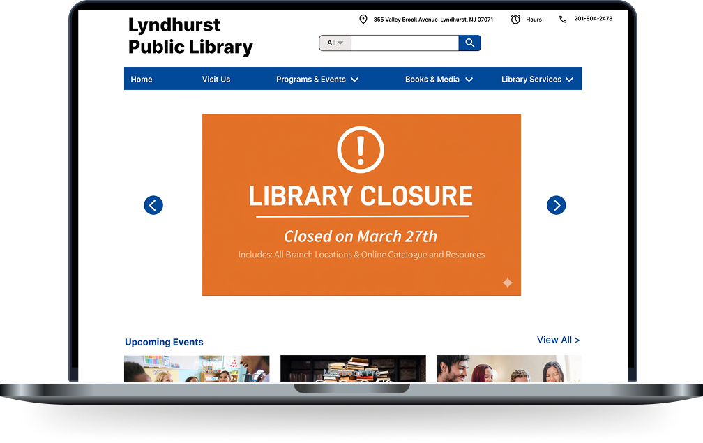
The Home screen serves as the main entry point of the website — where users can quickly access key information like hours, events, and resources. It provides a clear, organized overview that helps users find what they need efficiently and feel confident navigating the site.
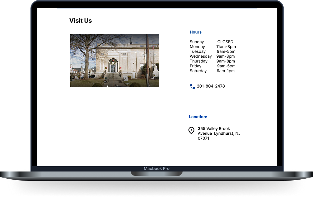
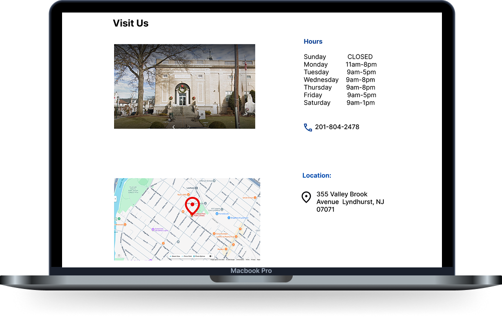
The “Visit Us” page provides essential information such as location, hours, and directions, making it easy for users to plan their visit. It is designed to be clear and accessible across both desktop and mobile, ensuring users can quickly find what they need on any device.
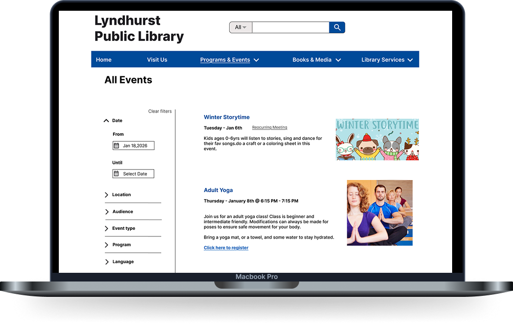
The All Events page allows users to easily explore what’s happening at the library. Events are presented in a clear and organized layout so users can quickly browse, discover, and decide what they’re interested in. The goal was to make finding events feel simple and engaging rather than overwhelming.
The Catalog page is where users can explore the library’s collection of books and resources. It was designed to make browsing intuitive and efficient, helping users quickly navigate through options without confusion. The goal was to create a smooth experience that supports both searching and casual exploration.
The Search Results page provides users with clear and relevant results based on their search. Information is displayed in a clean, scannable way, allowing users to quickly compare options and find the right book. The goal was to support fast decision-making while keeping the experience simple and user-friendly.
Usability Test Results
I conducted usability testing with five participants to evaluate the Lyndhurst Public Library website prototype. The goal was to observe how easily community members could locate vital information like operating hours and physical location, search the digital and physical catalog, and discover upcoming community programs. I focused on validating the effectiveness of search filters and identifying any technical friction points within the navigation menus.
Findings
Successes: Participants found the "Visit Us" link and library hours immediately, with some rating the task as 5/5 for being self-explanatory.
Search & Events: The search bar placement and visual book covers for "Best Sellers" aligned well with user expectations , and 100% of participants successfully located the event calendar.
Areas for Improvement: Testing revealed that users expected the address to be a direct link to Google Maps and felt that some search icons were too small to click easily.
Conclusion
Overall, the Lyndhurst Library prototype is clear, intuitive, and highly functional. Users were able to complete core tasks, such as finding hours and locating the event calendar, with minimal friction. Addressing minor interactive "glitches" in the dropdown menus and adding direct Google Maps integration for the physical address will move this from a strong prototype to a professional-grade user experience.
Iterations
I iterated on the 'All' filter button to enhance its discoverability and ease of use. Participants previously noted that the search icons and filter triggers felt undersized, which created a technical friction point. To resolve this, I increased the button's scale and padding, making it more visually prominent and providing a larger touch target for mobile users. This adjustment ensures that users can more comfortably interact with the catalog filters, specifically when toggling between digital and physical media types.
Before
After
I iterated on the design by transforming the location into an interactive link that opens directly in Google Maps. This change reduces user effort and friction for community members planning a physical visit, ensuring a more seamless transition from digital browsing to in-person navigation.
Before
After
If I had more time…
If I had more time, I would expand the project’s scope to include robust accessibility testing to ensure the library’s resources are fully usable for individuals with motor or visual impairments. I would also develop the "Upcoming Events" section into a fully interactive calendar with registration features and add localized parking information to the map integration to further simplify physical visits.
Key Learnings
Trusting Research: This project reinforced the importance of letting user data, rather than personal preference, guide every design decision.
The Power of Prioritization: I learned that simplifying complex information and deprioritizing less-used content is essential to creating a clean, intuitive experience.
Impact of Small Fixes: I discovered that minor interactive improvements such as fixing "hover gaps" or adding a direct map link can significantly elevate a prototype's overall professionalism.
Information Architecture is Foundation: Focusing on the structure of the site early on made the final visual design decisions much easier and more effective for the user.