
CareAI: Healthcare Assistant
A healthcare assistant app designed to simplify the process of finding and booking providers based on user symptoms. It helps users navigate care decisions with AI-guided recommendations, insurance aware results, and a seamless booking experience.
Role: UX/UI Designer & Researcher.
Duration: 6 weeks.
Tools: Figma, Miro.
Problem
Navigating complex health care systems often lead users to feeling overwhelmed when trying to triage the type of care they need. Users need a guided and streamed line approach to identifying current issues and finding care rather than fragmented tools like Google or insurance portals.
Who am I designing for?
This experience is designed for individuals who are seeking medical care but may feel unsure about where to start. These users often rely on quick online searches and want clear, trustworthy guidance to help them make decisions. They value simplicity, speed, and confidence—especially when navigating something as stressful and important as their health.
Listening Before Solving
I aimed to understand how people navigate healthcare decisions when experiencing unfamiliar or urgent symptoms, what challenges and emotional stress they face during this process, and how they determine where to seek care.
The goal was to uncover insights that would guide the design of a more supportive and intuitive experience, one that reduces confusion, helps users make informed decisions, and increases confidence when choosing the right type of care.
This plan included:
User Interviews.
Secondary Research
User Interviews
I recruited 5 participants with different levels of experience navigating healthcare, including individuals who rely on insurance apps, online searches, and personal judgment when seeking care. The goal was to understand their behaviors, frustrations, and decision-making process when dealing with symptoms, as well as what would make finding the right care feel easier, faster, and more trustworthy.
Competitive Analysis
After conducting user interviews, I explored the tools participants currently use to find care, such as Zocdoc, insurance apps, and online search tools. This helped me understand the existing solutions in the market and identify where they succeed and where they fall short.
Key Insights
Users rely on multiple tools instead of one solution
Platforms focus on search, not guidance
Insurance apps provide data, but lack clarity
AI tools provide answers, but lack trust and real integration
Opportunity
This revealed an opportunity to design a more guided, all-in-one experience that supports users from symptoms to provider selection in a clear and confident way.
Affinity Map
After conducting user interviews, I organized the findings into an affinity map to identify patterns and uncover key themes. This process helped me move from raw data to clear, actionable insights by grouping responses around areas such as decision-making challenges, insurance concerns, trust, and the need for guidance. Visualizing these patterns made it clear that users were not struggling with access to information, but with making confident decisions in highlighting the importance of clarity, simplicity, and support in the design.
Challenges
Users rely on multiple tools like Google, insurance apps, and reviews to make healthcare decisions
Confusion around choosing the right type of care (ER, urgent care, specialist)
Too much scattered information makes the process time-consuming and overwhelming
What Users Wanted
Clear, step-by-step guidance on where to go
Providers that match their insurance without extra effort
Fast, simple access to relevant and trustworthy information
Emotional Motivations
Users want to feel confident they are making the right healthcare decision
They seek reassurance, especially in stressful or urgent situations
Avoiding unexpected costs and mistakes is a major emotional driver
Privacy Concerns
Users want reassurance that their personal health data is secure
They expect transparency in how their information is used
Trust is essential before relying on any digital healthcare tool
User Personas
From these insights, I developed two user personas that captured the core characteristics, goals, and pain points of my primary users people who want to make informed, confident healthcare decisions but are held back by confusing information, opaque insurance systems, and a lack of trustworthy guidance when they need it most.
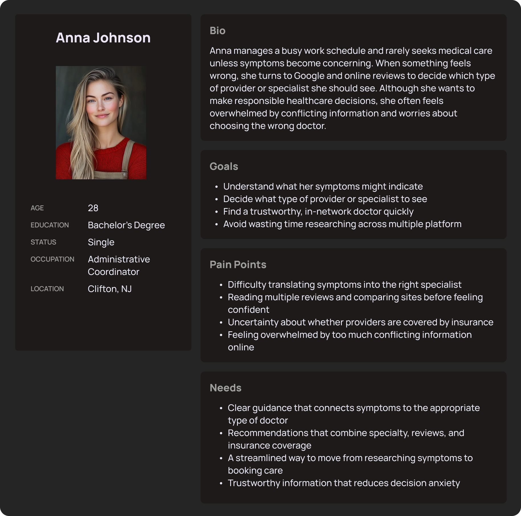
Anna Johnson, 28, Administrative Coordinator from Clifton, NJ, represents the user who wants to take charge of her health but gets paralyzed by conflicting information, too many platform options, and uncertainty about what her insurance covers. She doesn't need more data — she needs a guide she can trust.
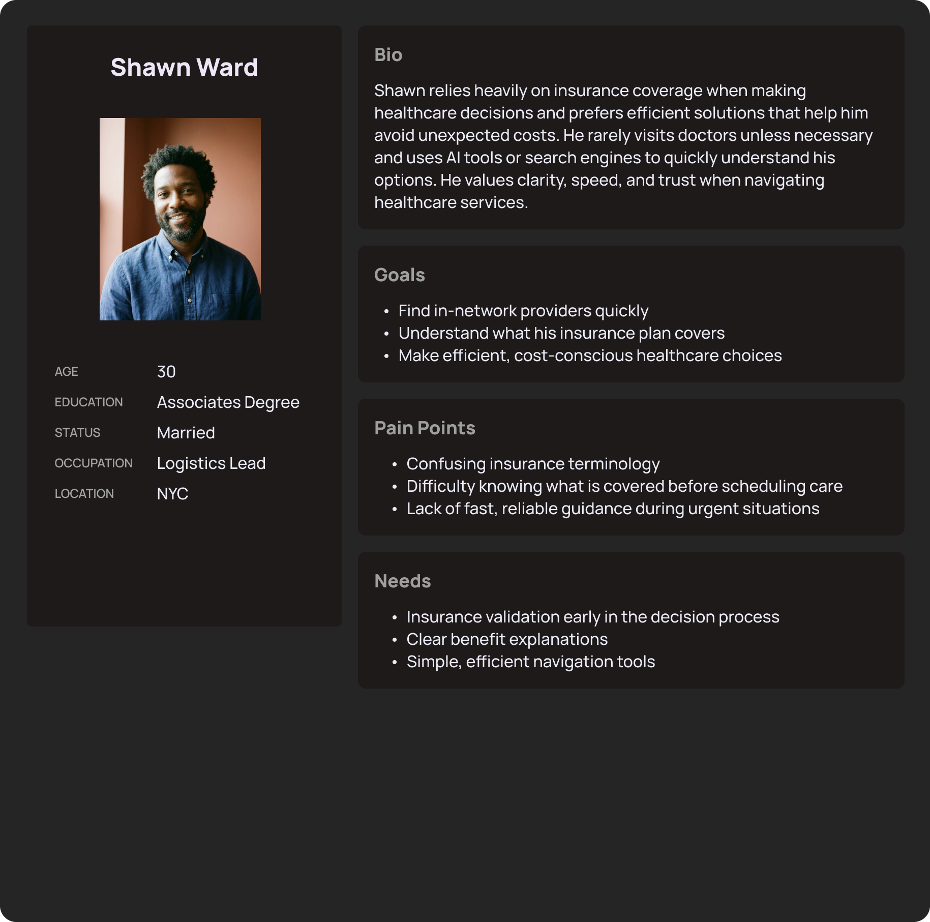
Shawn Ward, 30, Logistics Lead from NYC, represents the user who treats healthcare like a system to optimize but keeps running into walls of confusing terminology and unclear coverage. He avoids doctors unless necessary and just wants fast, transparent answers before things become urgent.
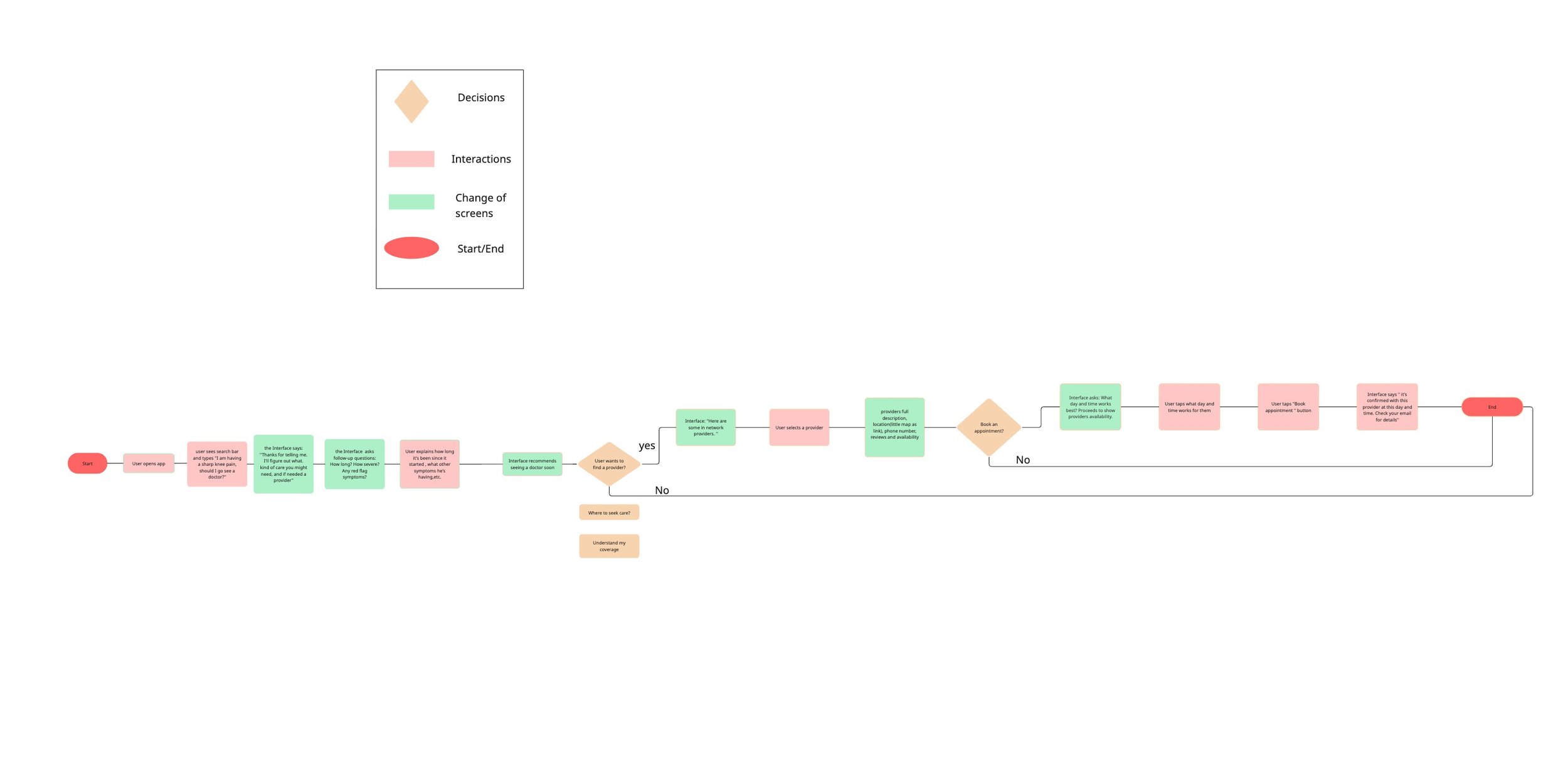
User Flow
After defining the core features and understanding user needs, I created a user flow to map how users would navigate the CareAI experience from entering their symptoms to receiving a provider recommendation and booking an appointment.
The goal of this flow was to ensure the path from confusion to clarity felt simple and trustworthy. It helped identify key decision points before moving into wireframing and refining the interface.
Lo-Fi Wireframes
After defining the user flow, I moved into creating low-fidelity wireframes to visualize the structure of the CareAI experience.
At this stage, my focus was on functionality, hierarchy, and usability not aesthetics. I developed simple wireframes to explore different layouts for key screens such as the symptom input, AI-generated provider recommendations, insurance validation, and appointment booking flow.
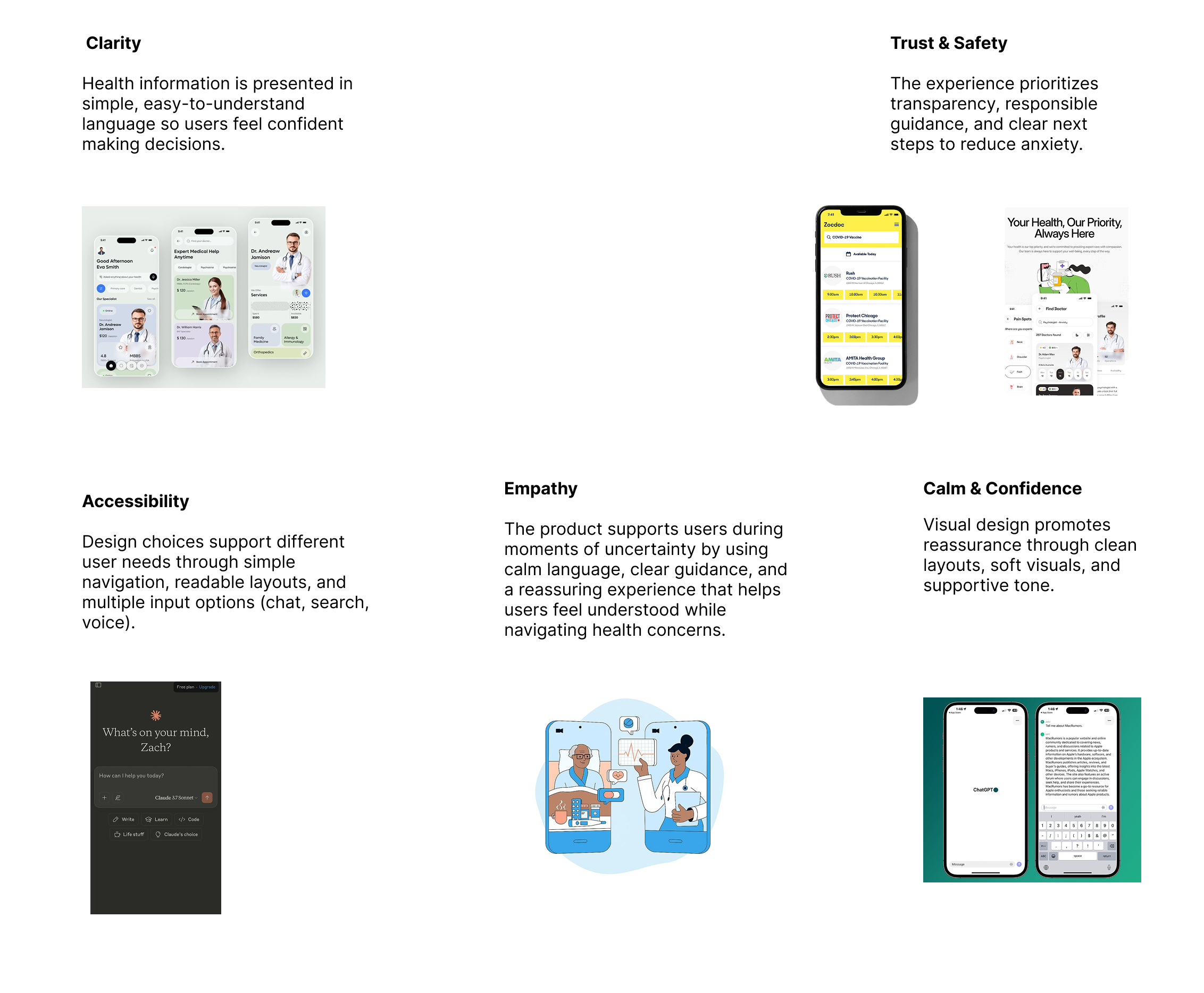
Moodboard
For CareAI's visual direction, I wanted every design decision to feel intentional and human. The moodboard was guided by five core principles: clarity, trust & safety, accessibility, calm confidence, and empathy. The overall vibe is clean, soft, and reassuring — a space that feels less like a clinical tool and more like a knowledgeable friend walking you through your health journey with honesty and care.
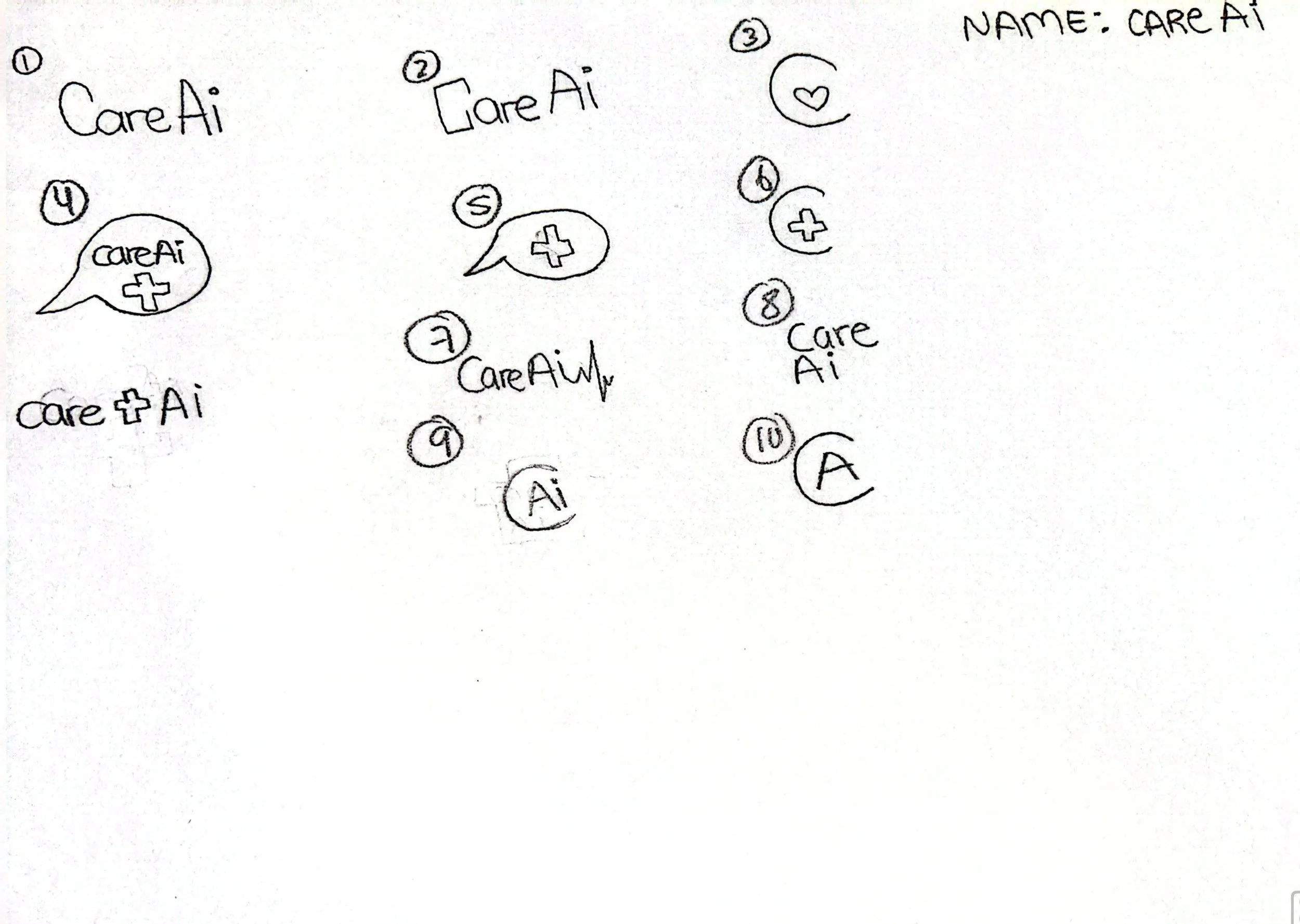
Logo
Designing the CareAI logo went through several iterations, exploring different icon combinations, wordmarks, and symbol styles before landing on the final direction. I experimented with various ways to blend the idea of health and AI together, but ultimately chose the wordmark with the heartbeat line, as it best captured the balance between medical trust and intelligent technology, simple, clean, and instantly recognizable.
This is the final logo I chose
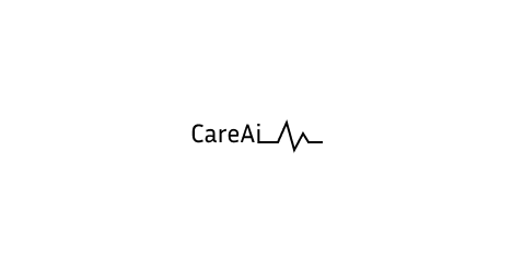
Why I chose this?
I chose a wordmark over an icon-first mark because trust and legibility mattered more than novelty — users needed to recognize CareAI instantly, especially in moments of stress. The heartbeat line does double duty: it's the most universal visual shorthand for 'health' with zero learning curve, and its clean, single-line style keeps the AI association feeling calm and human rather than clinical or futuristic.
Mid-Fidelity Wireframes
After testing initial ideas through low-fidelity wireframes, I moved into mid-fidelity designs to refine the structure, layout, and interactions of the CareAI experience. At this stage, my focus was on hierarchy, spacing, and interaction patterns rather than visuals. Through this process I confirmed that the conversational chat structure was the right approach for guiding users from symptoms to booking, setting the foundation for the high-fidelity designs.
Hi-Fidelity Wireframes
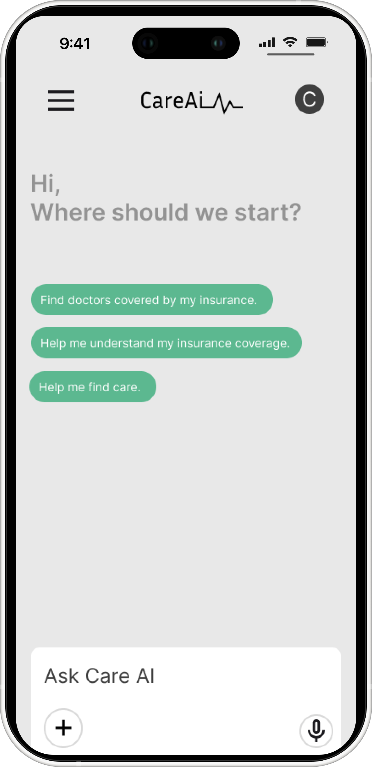
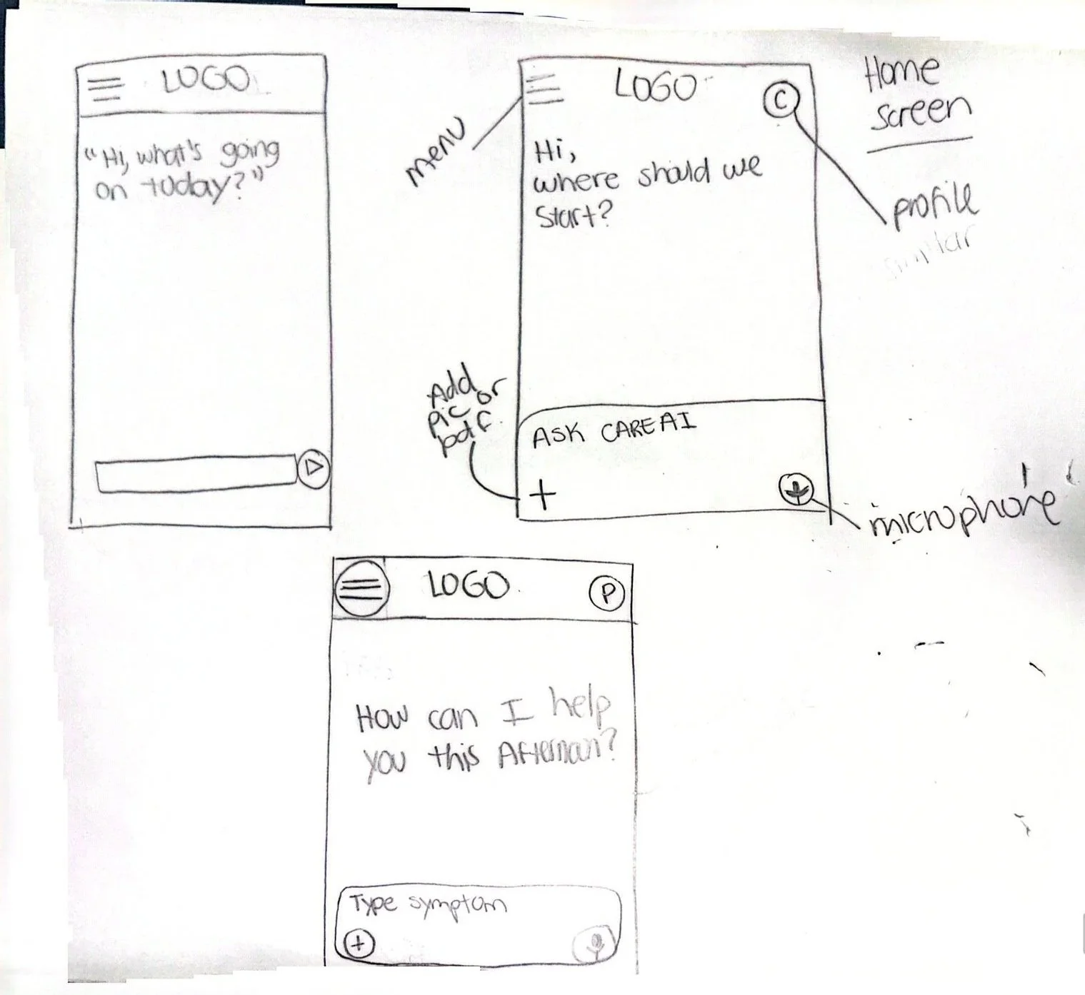
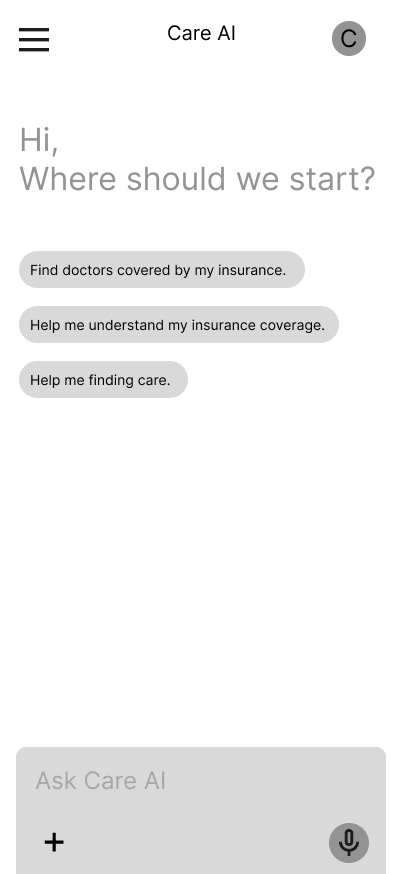
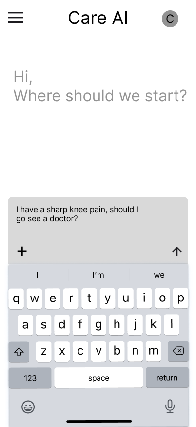
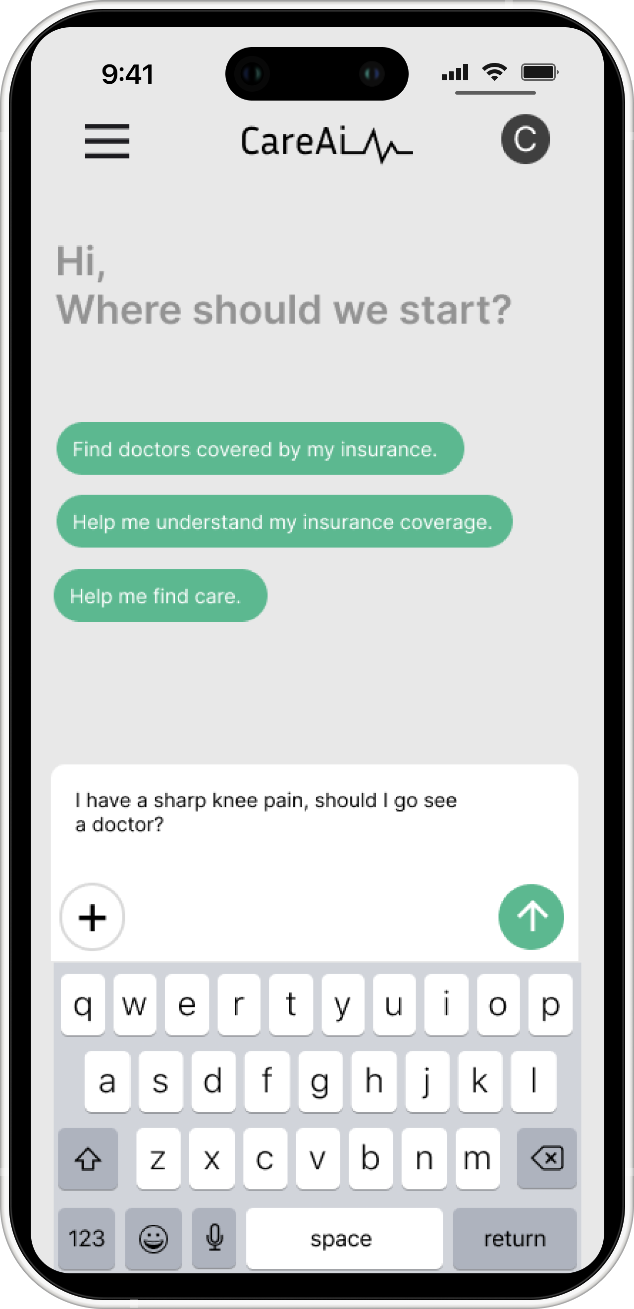
Home / Conversation Starter
The AI greets the user with quick-select prompts instead of a blank field. Research showed users often don't know how to start describing a health concern, so giving them a starting point lowers the barrier before they type anything.
Quick-select prompts for common needs
Open text field for custom questions
Voice input option

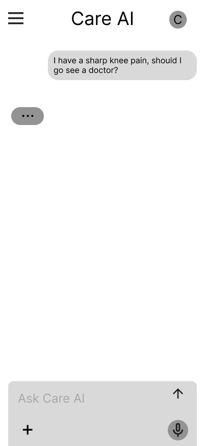
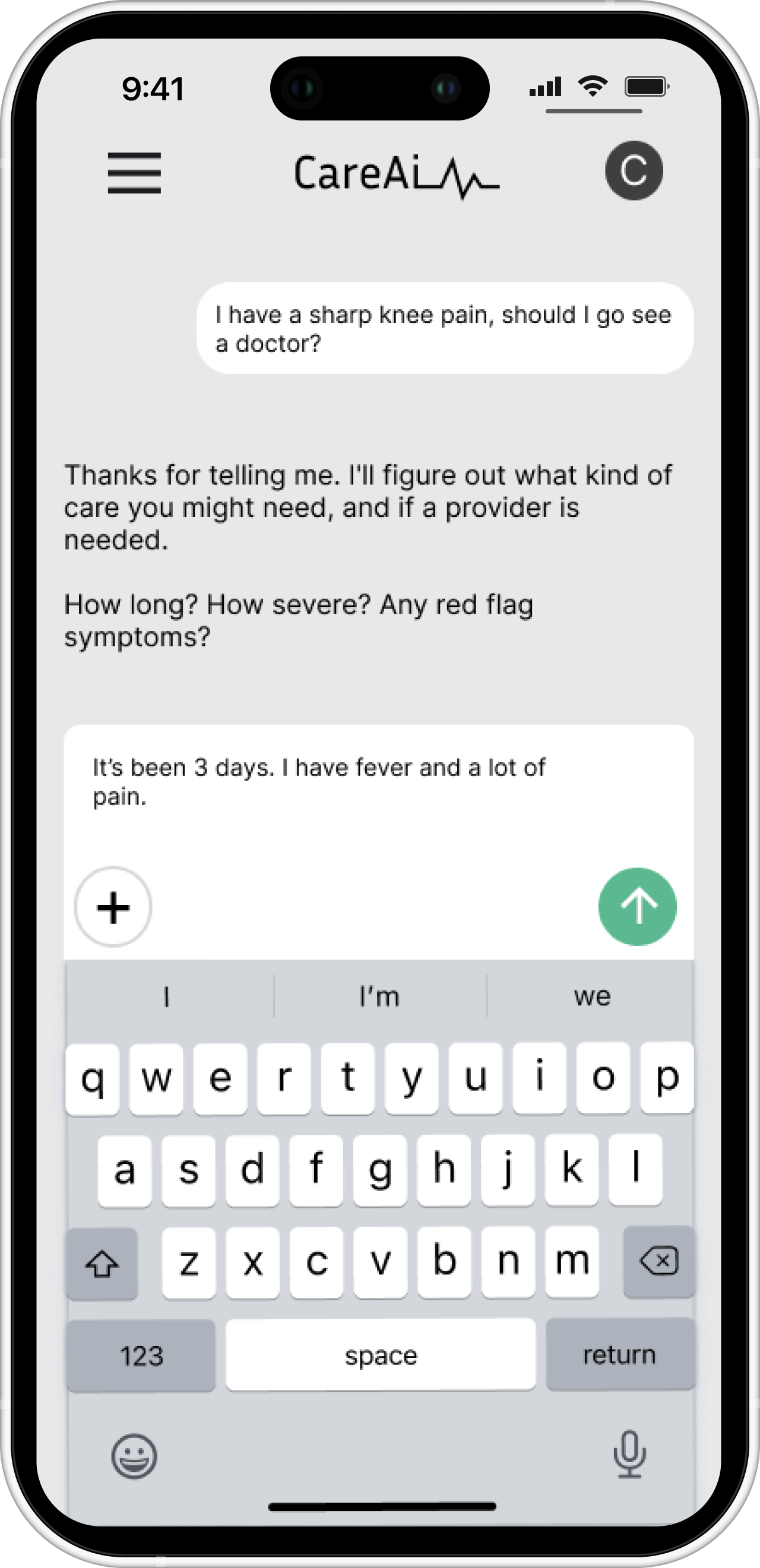
Symptom Input
The user describes symptoms in their own words, no medical terminology required. I used free text instead of rigid form fields because interviews showed users felt intimidated when they didn't know the "right" words.
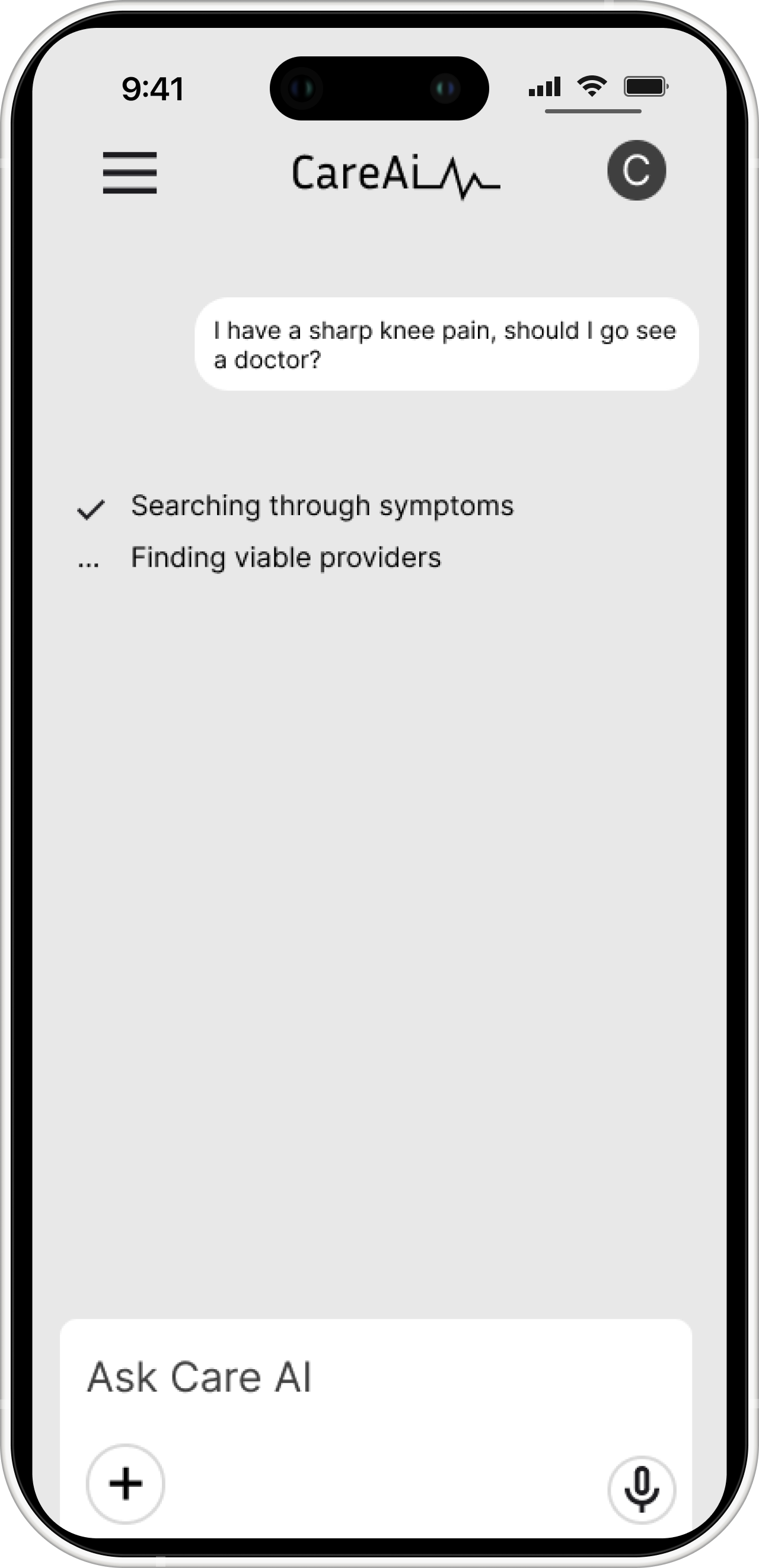
AI Processing / Loading State
A subtle typing indicator reassures the user the AI is working. A chat-style loading pattern, not a generic spinner, keeps the interaction feeling human and reduces anxiety during the wait.
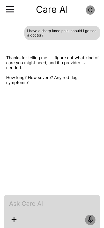
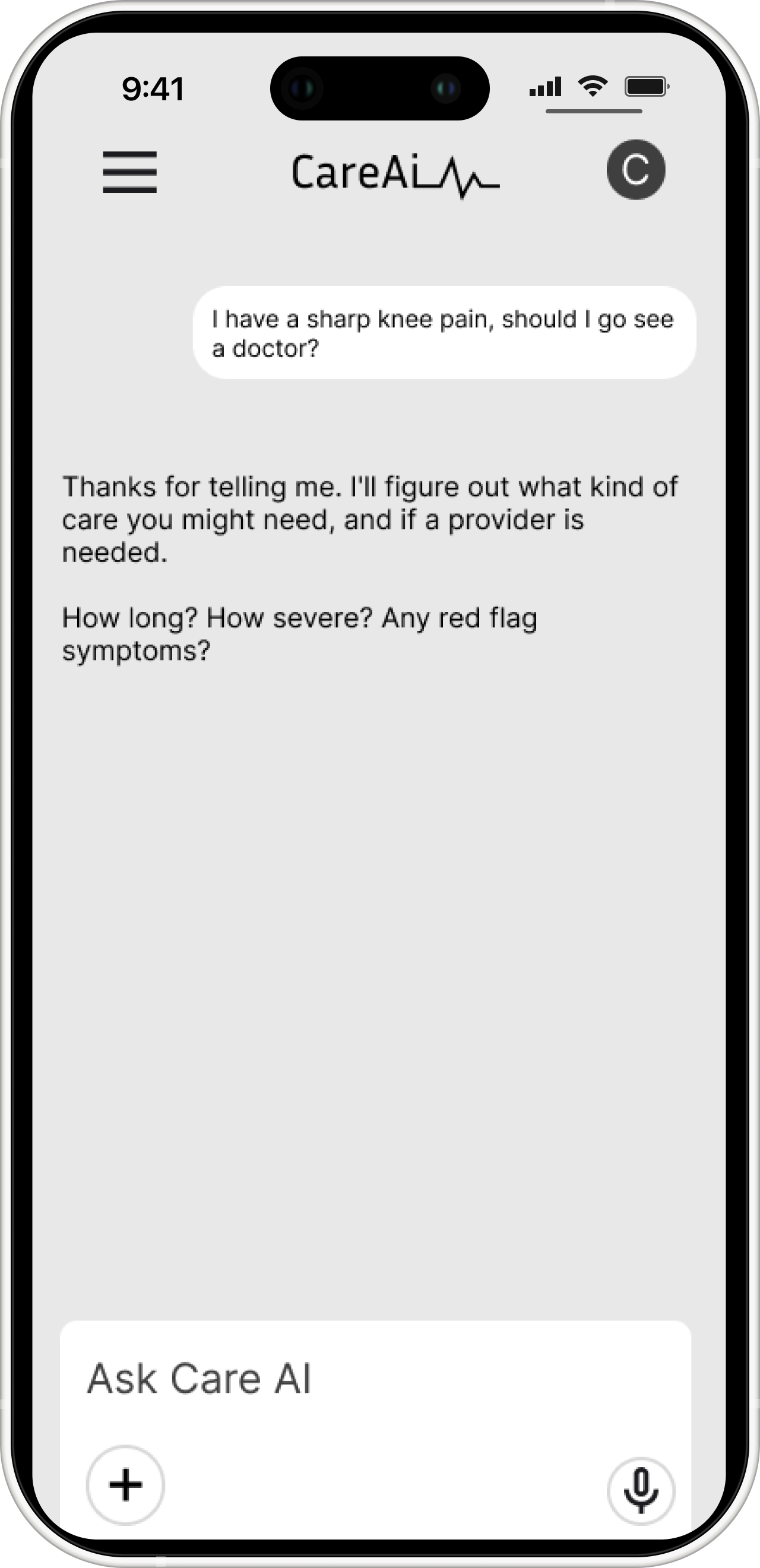
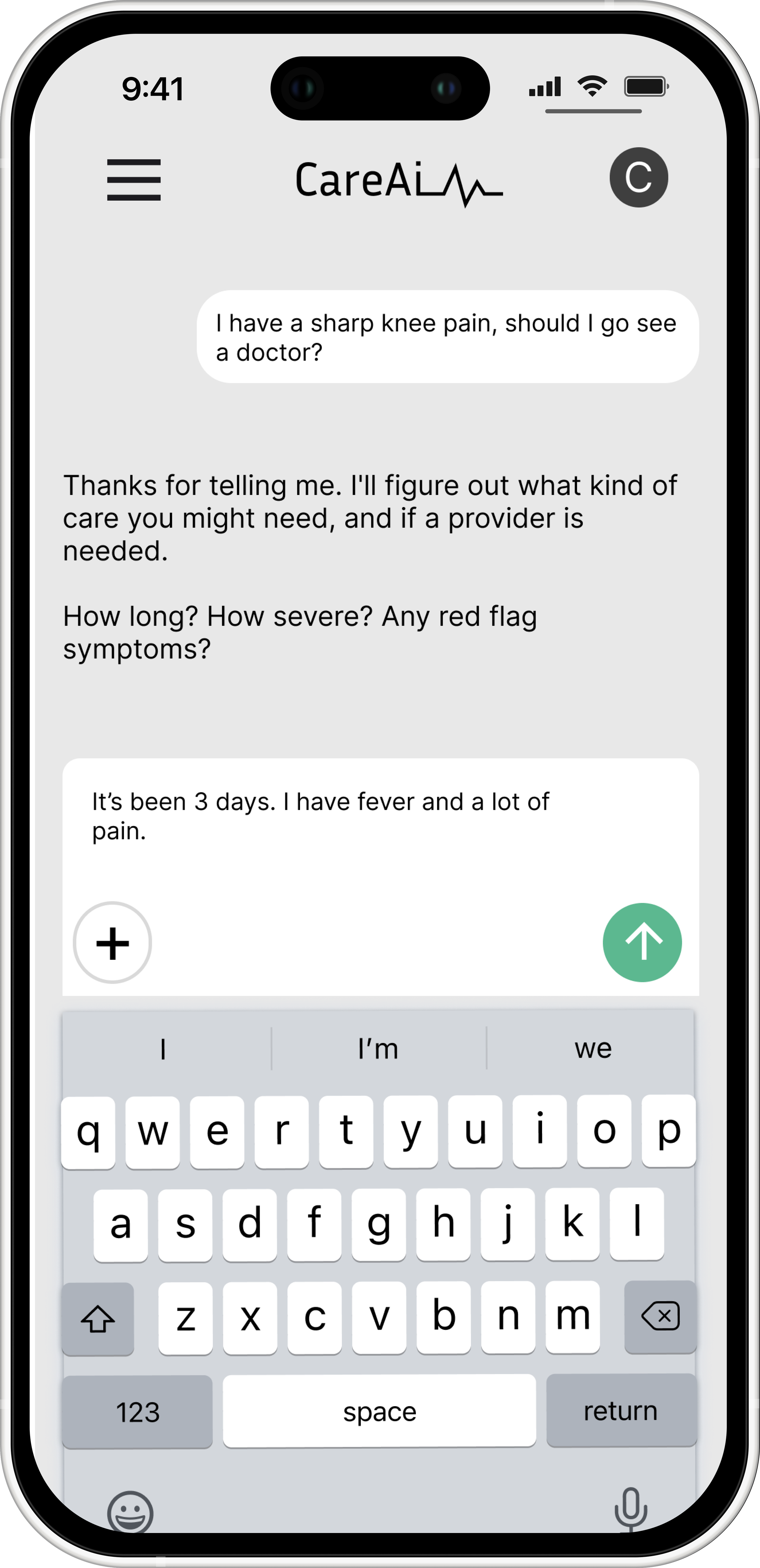
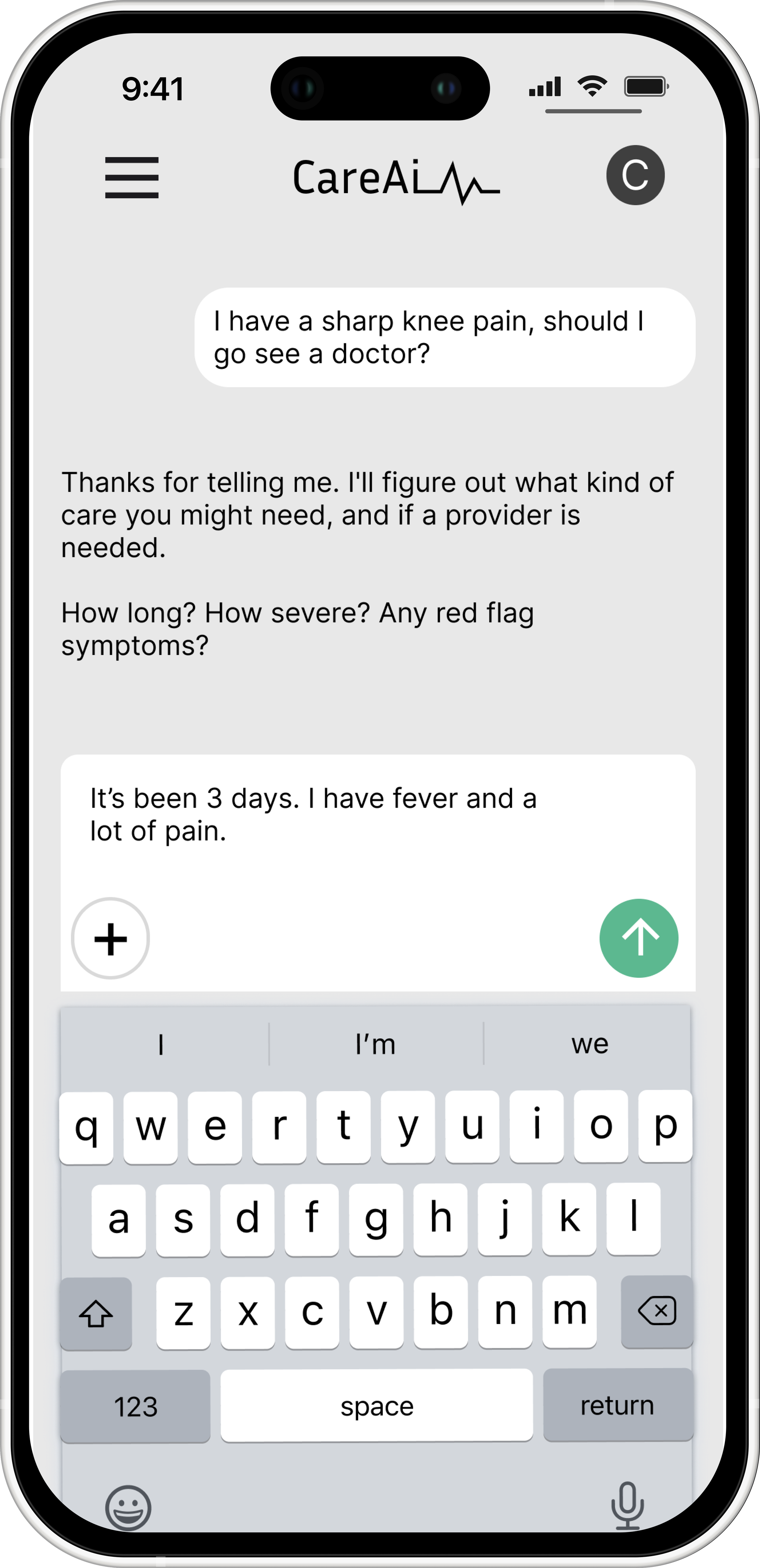
AI Follow-Up Questions
The AI gathers context one question at a time, conversationally. Research showed users disengage with long forms — this keeps them engaged while reducing the risk of a misguided recommendation.
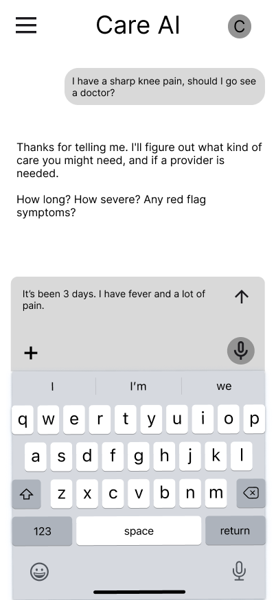
AI Follow-Up & User Response
AI asks targeted follow-ups and the user responds freely, no form fields. This open-ended back-and-forth is what made participants compare CareAI favorably to clinical, form-heavy tools.
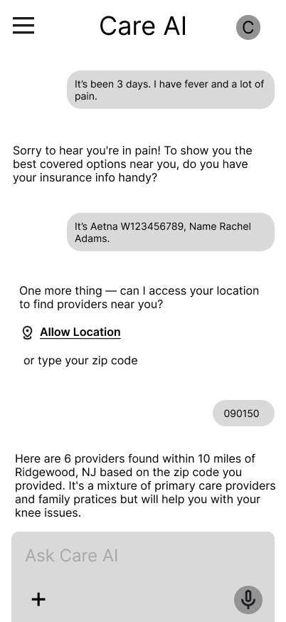
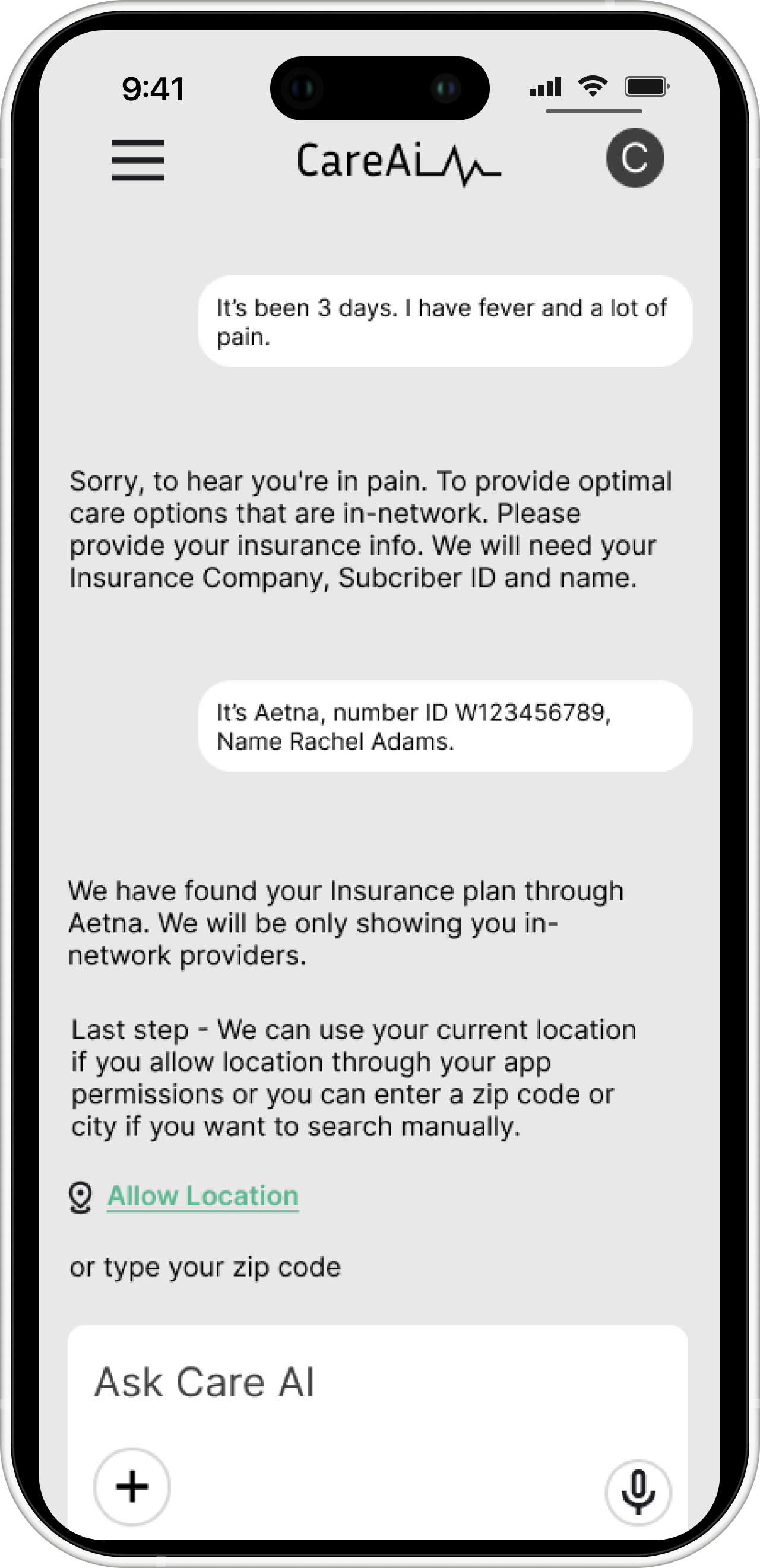
Insurance & Location Collection
The AI collects insurance and location conversationally instead of through a form. Insurance was one of the biggest sources of confusion in interviews, so asking mid-conversation keeps it feeling like guidance, not paperwork.
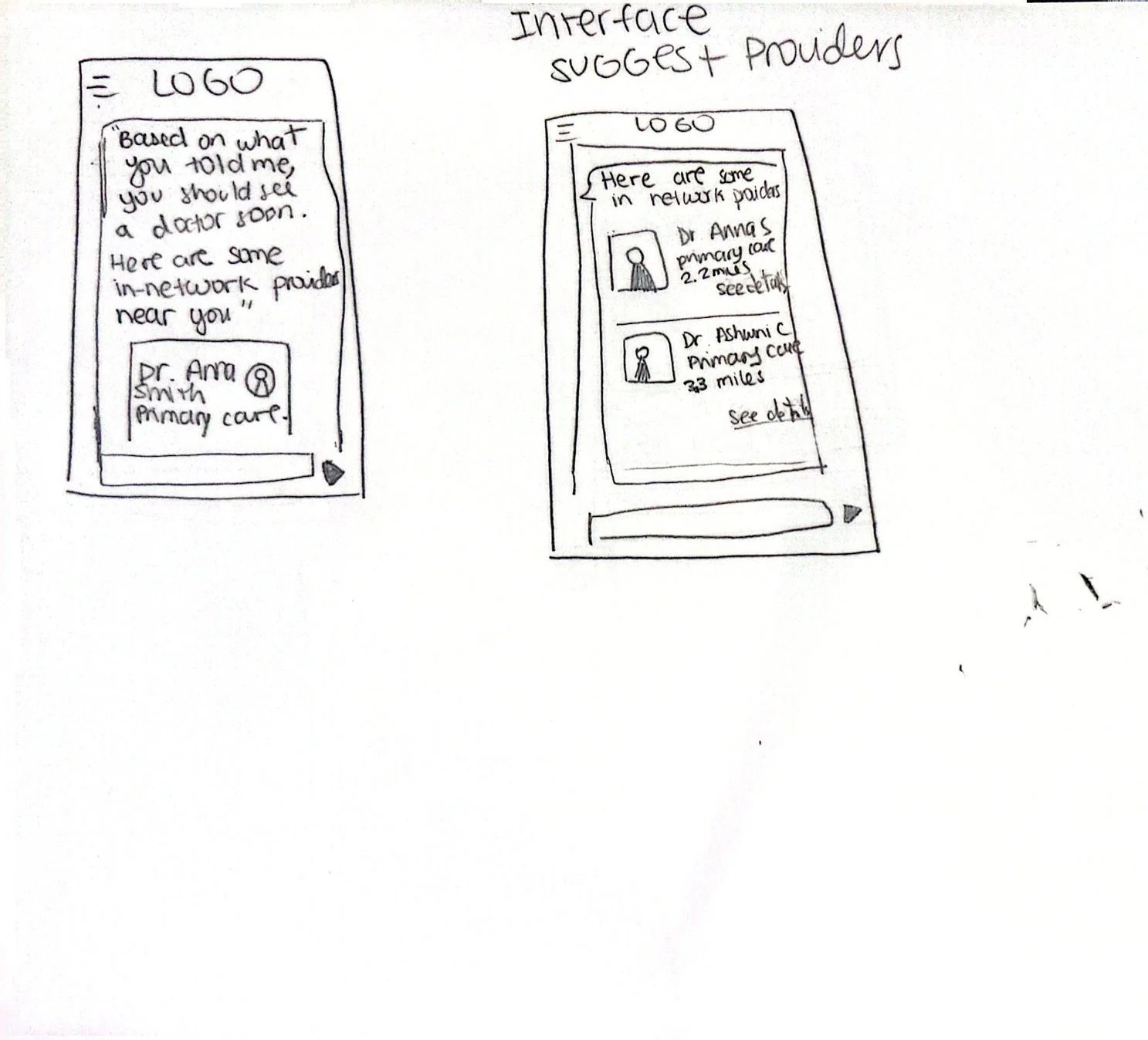
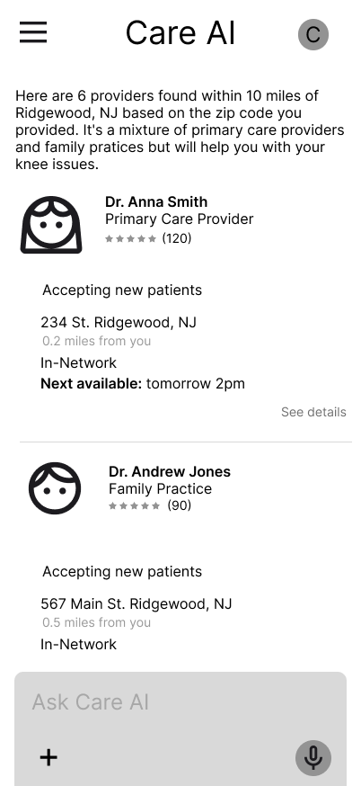
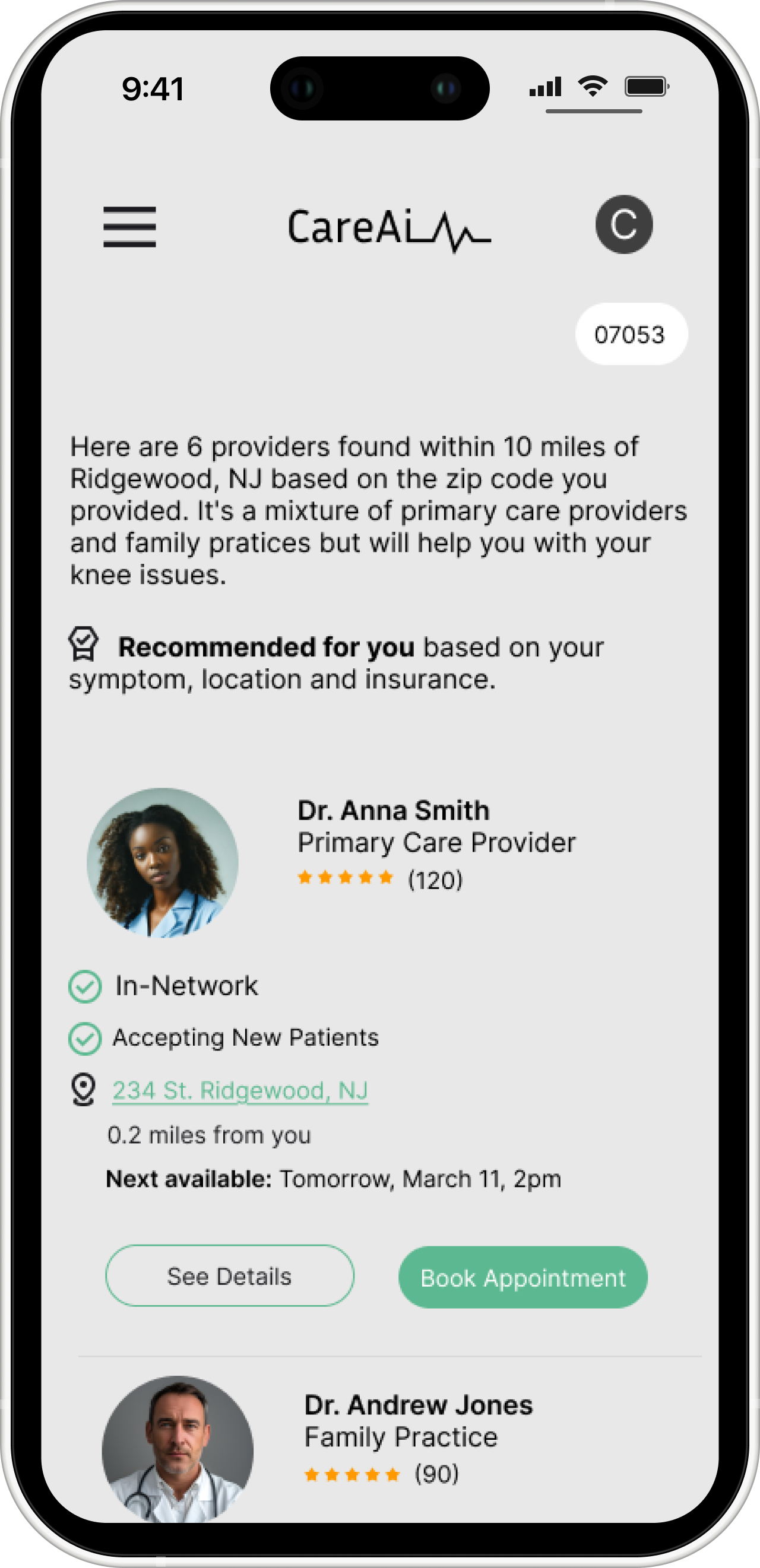
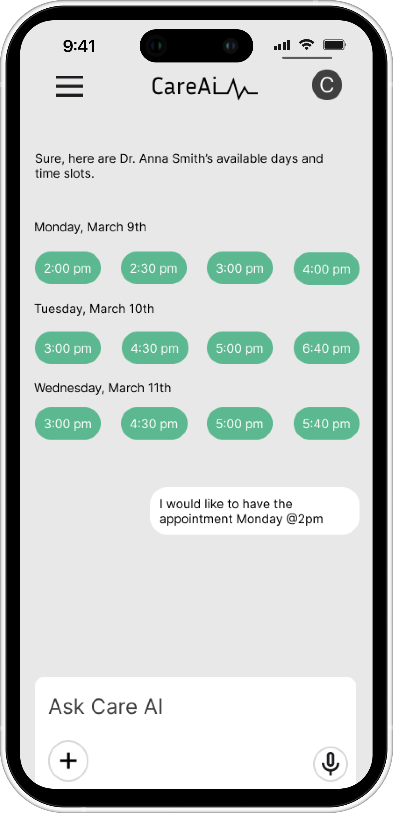
Provider Results
A list of in-network providers matched to symptom, location, and insurance. The in-network badge responds directly to research: avoiding unexpected costs was a top emotional driver, so surfacing coverage upfront builds trust before the user has to decide.
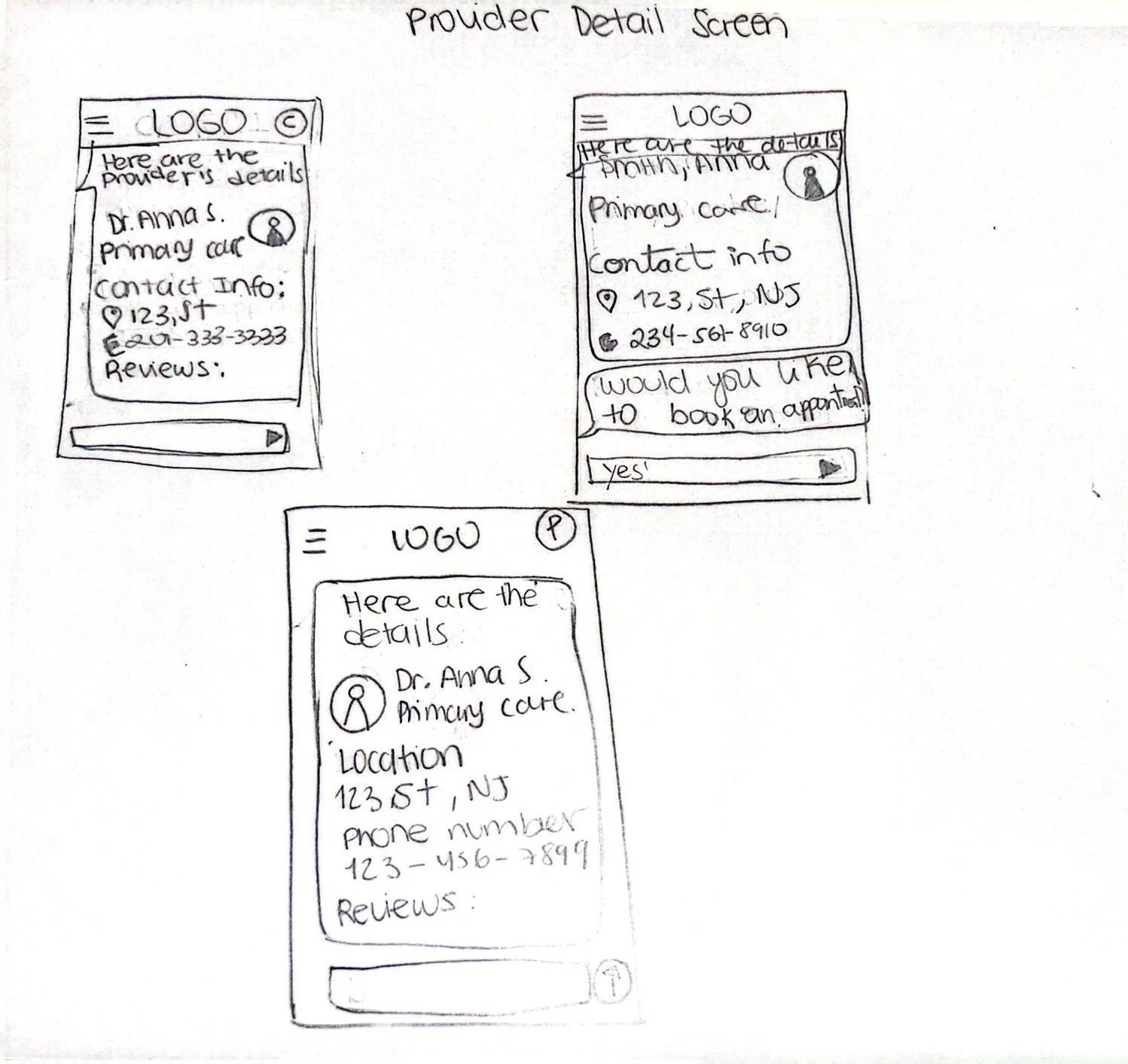
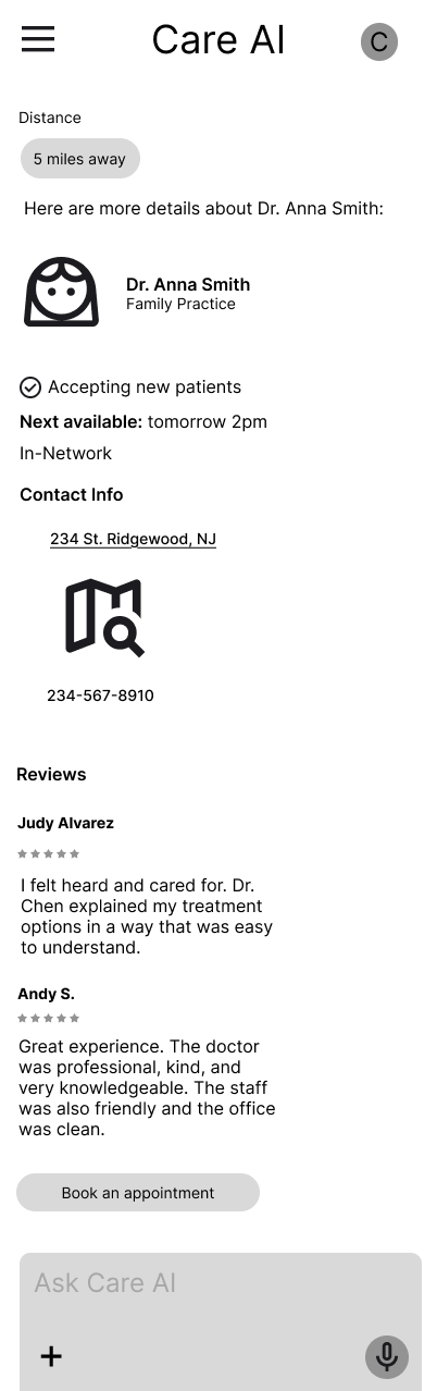
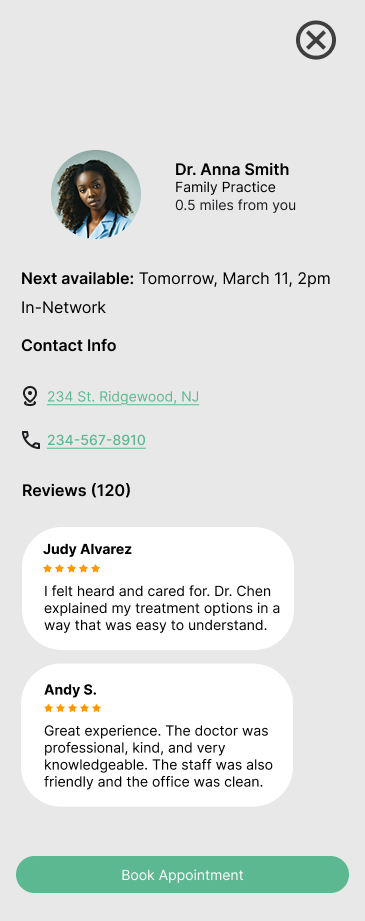
Provider Details- Modal View
A detailed provider view with everything needed to book confidently. Real patient reviews sit alongside distance and availability because trust, not just convenience, is what determined whether participants would actually book.
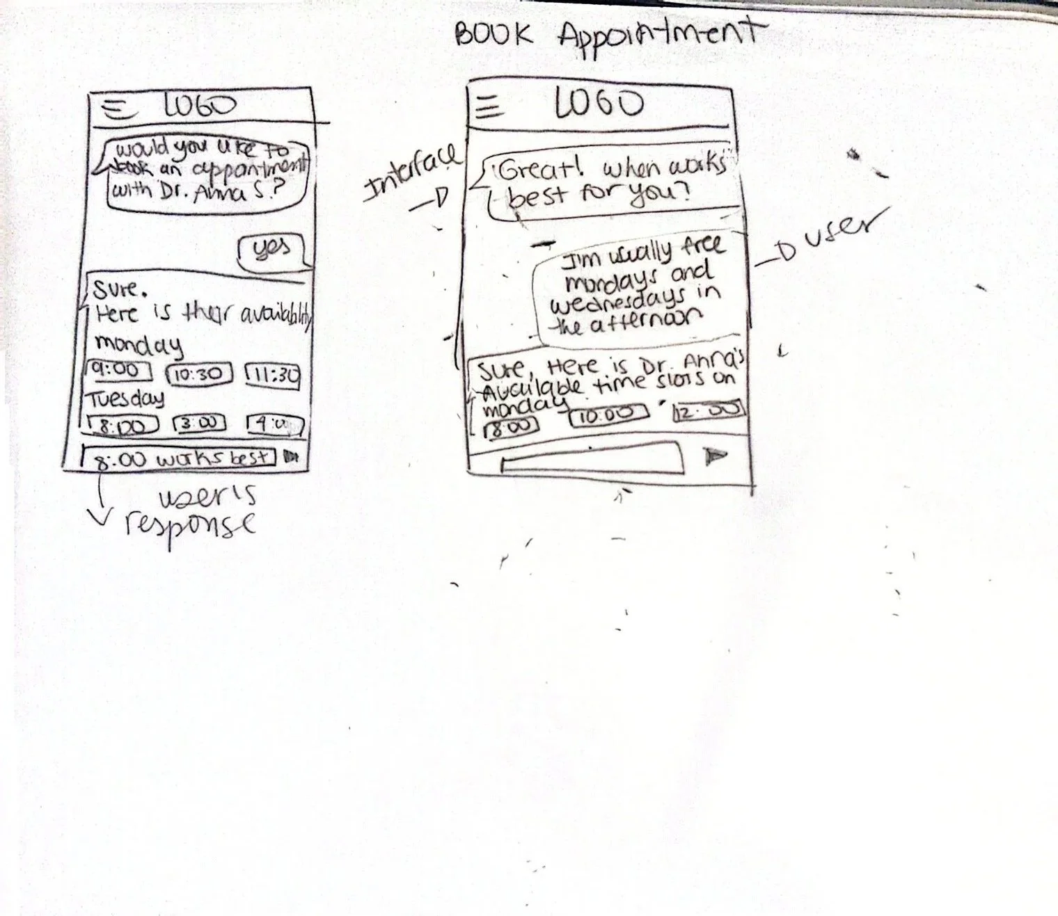
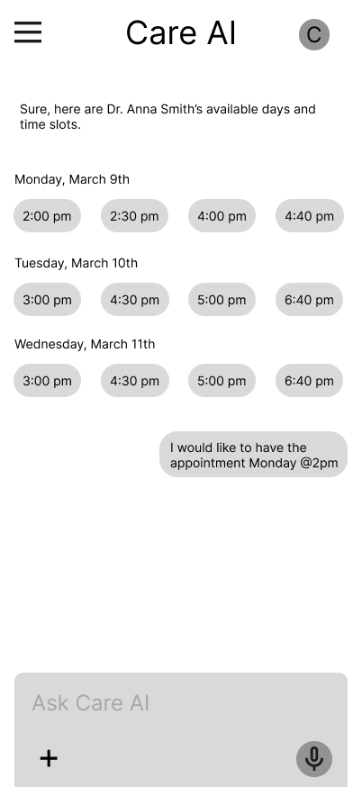
Appointment Scheduling
The user picks a time slot in-conversation rather than a separate booking page. Participants were frustrated by juggling disconnected tools, keeping this in-flow collapses that into one continuous experience. Multiple days and times displayed clearly
User confirms preference in natural language
No need to leave the app or visit a separate booking platform
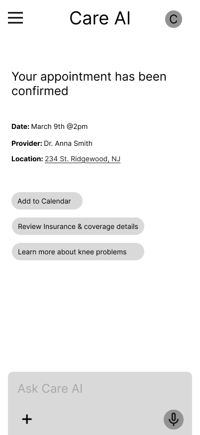
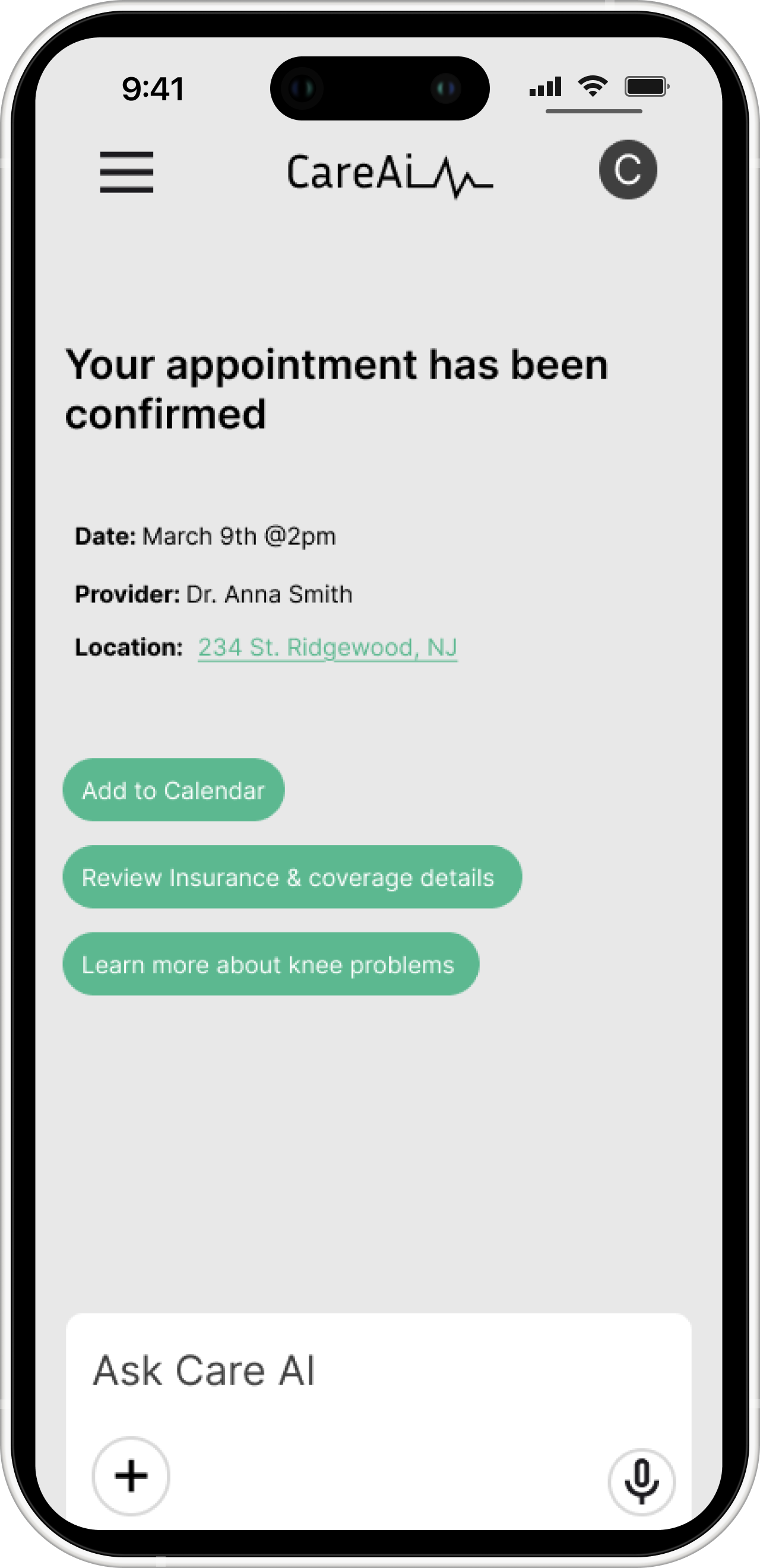
Appointment Confirmation
A confirmation screen summarizing date, provider, and location in one place. Participants wanted reassurance after stressful decisions, so closing the loop clearly, not just ending the flow — mattered.
Usability Testing Results
I conducted usability testing with five participants to evaluate the CareAI prototype. The goal was to observe how easily users could complete key tasks such as entering symptoms, receiving AI-generated provider recommendations, and booking an appointment while assessing the clarity and trustworthiness of the overall experience.
Key Learnings
The symptom-based AI flow was a standout — users loved not having to know what type of doctor to search for
The booking flow felt seamless and transparent, with clear time slots and confirmation
Multiple participants compared it favorably to Google, Zocdoc, and Aetna, calling it faster and less overwhelming
Iteration-Conversational Hierarchy
"Why does the AI's text look bigger than mine?"
One participant noticed that their typed messages appeared visually smaller than the AI responses, which created a subtle sense of imbalance in the conversation. This made the interaction feel less like a dialogue and more like being talked at, which works against the core goal of CareAI feeling like a trusted, human-centered experience.
Before
After
If I had more time…
Deeper personalization — building out recommendation logic based on user history, preferences, and past appointments
Cost & insurance transparency — surfacing estimated costs and coverage breakdowns earlier in the flow to reduce financial anxiety
Accessibility improvements — ensuring the experience works seamlessly for users with different abilities and varying levels of health literacy
Conclusion
CareAI tackled a problem that genuinely affects people: the overwhelming, confusing experience of navigating healthcare. Every decision, from research to high-fidelity screens, was driven by one goal — helping users feel confident, supported, and less alone. Watching five participants move through the prototype with ease, and hearing them say they'd use it in real life, was the validation I needed.